Designing customer experiences across complex digital ecosystems.
Nathan Kopp: Lead/Senior Product / UX / UI Designer
I'm a product designer who can bridge customer needs, business objectives, design systems, and technical reality.
About Me
My role is to turn complex problems into simple, scalable experiences
-
![]()
CI&T Infomedia Automotive SaaS
-
![]()
Ramsay Health Care
-
![]()
Woolies X
-
![]()
Cover More
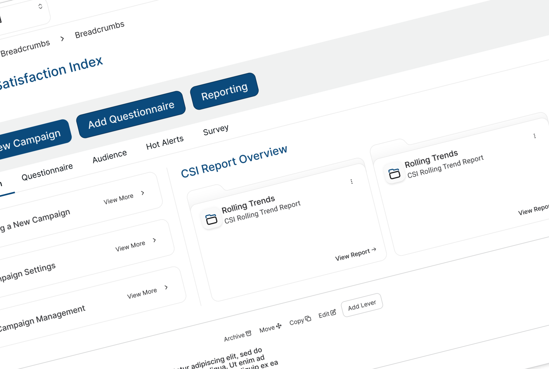
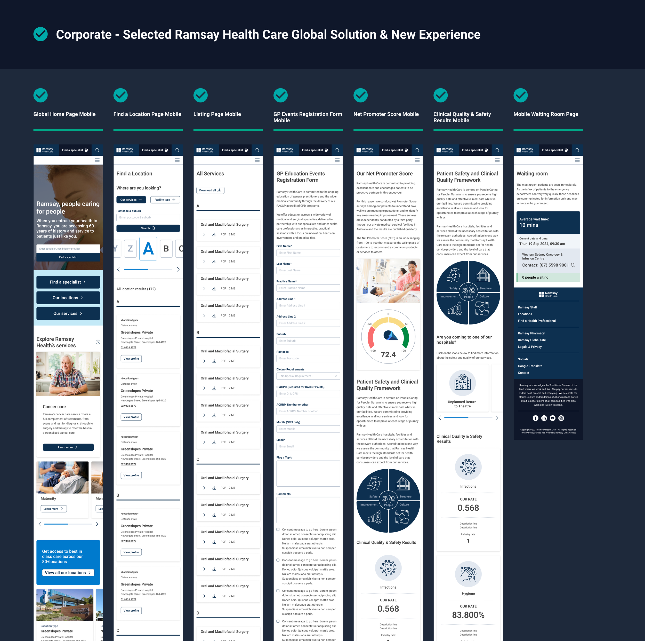
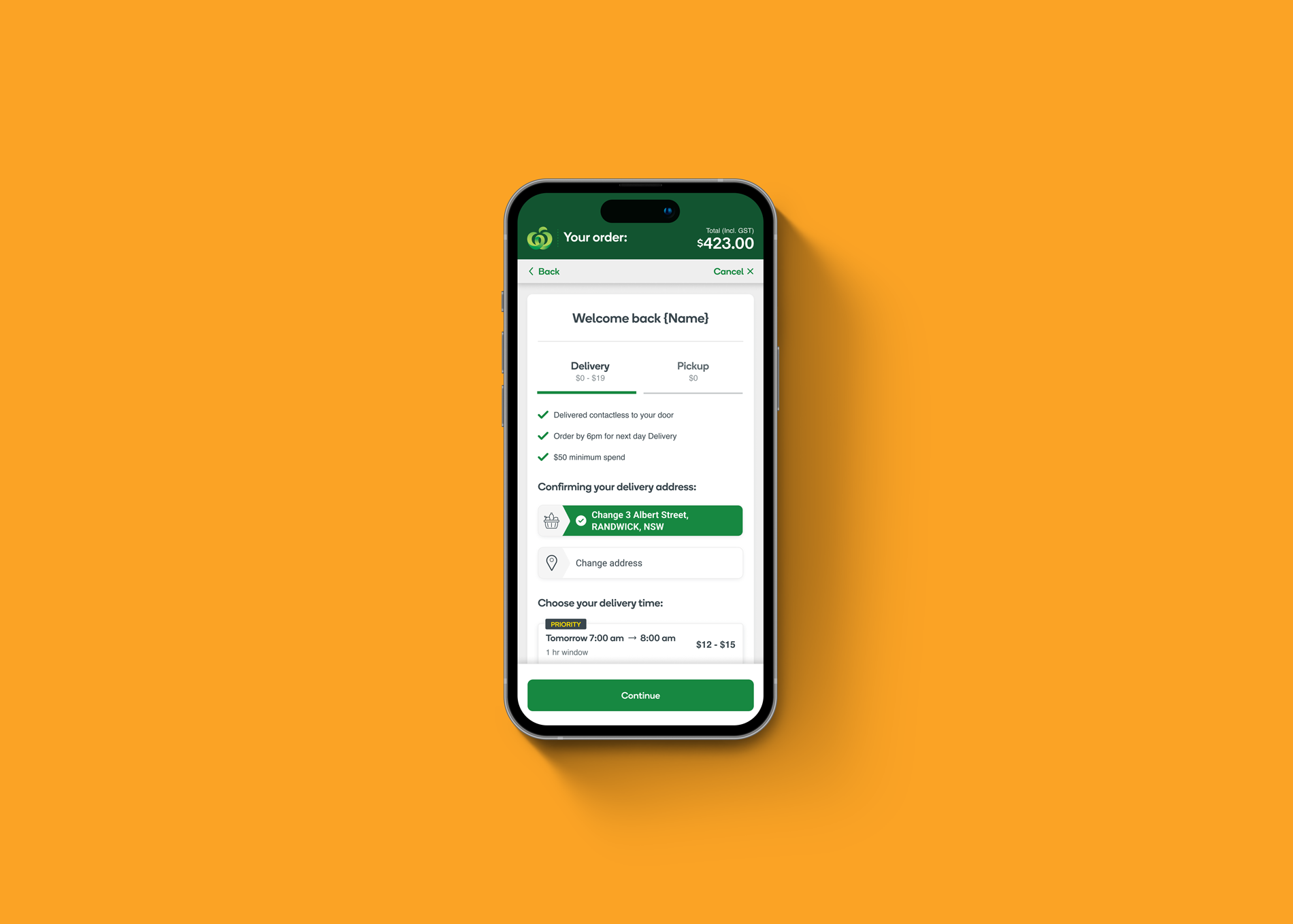
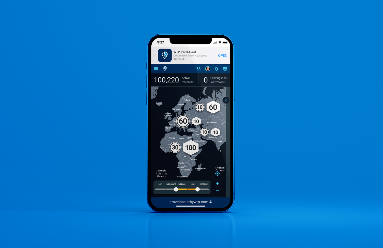
How I Work
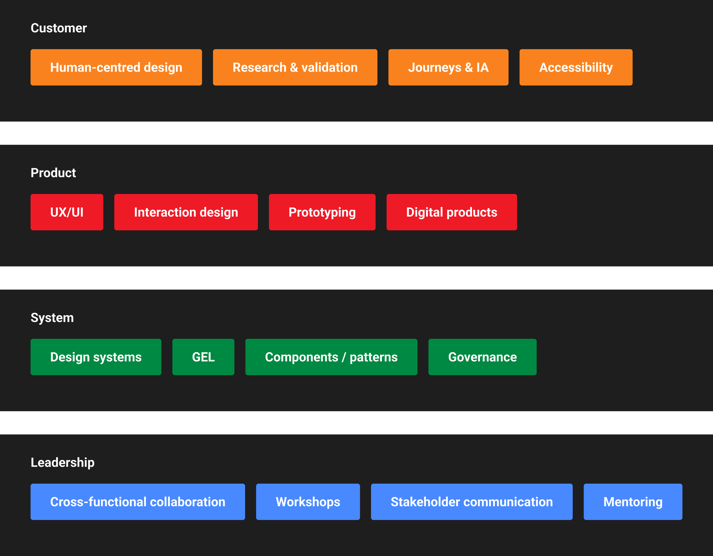
People + Product + Technology
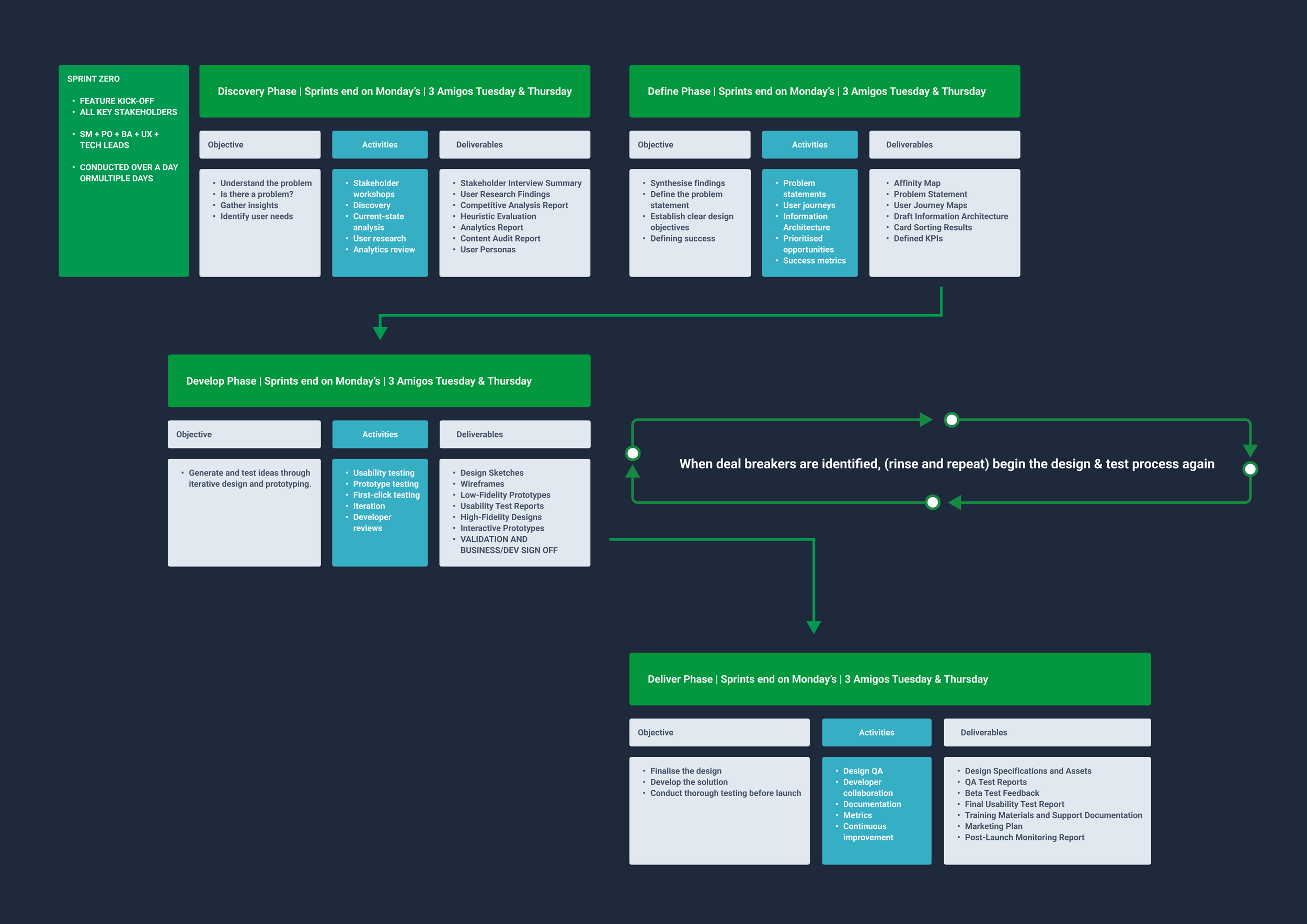
Youi needs
Customer-centred experiences
Complex digital products
Design architecture
Design systems
Technical collaboration
Senior stakeholder engagement
Cross-functional leadership
Prototyping/validation
Emerging technology
My experience
Woolworths, Ramsay
Infomedia/CI&T
Ramsay GEL
GEL/component libraries
CI&T/Agile product teams
Ramsay/enterprise programs
Product + BA + Engineering + Content
Figma/research/testing
Claude/AI design workflow
Case Study 1: Woolworths
How do you create a simple customer experience when the underlying fulfilment experience is anything but simple?


Designing transparency across a complex marketplace ecosystem Woolworths Grocery + Everyday Market
2021-2022
My Role.
Senior Product Designer
Contract Senior UI Design | Senior Product Design |
User Research | Testing | User Testing
-
I worked across the Woolworths digital ecosystem, focusing on:
Product design
UX strategy
User research
Interaction design
Prototyping
Testing
Design delivery
-
Working alongside:
Product Managers
Engineers
Content
Legal
Communications
Product Operations

The Challenge
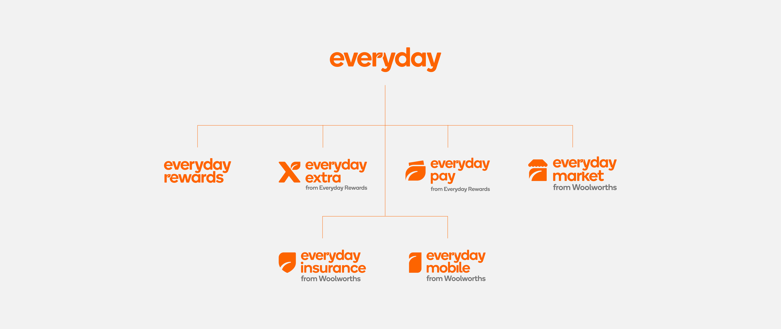
Customers saw Woolworths Grocery and Everyday Market as one unified shopping experience.
However, behind the scenes, they operated as two different fulfilment models.
-
Fulfilled through Woolworths stores and fulfilment centres
-
Fulfilled through external marketplace partners and courier networks
-
Multiple deliveries
Different arrival dates
Separate tracking experiences
Unexpected fulfilment behaviour
The Problem
Customers understood the brand. They did not understand the operational complexity behind it.
Customer mental model:
"I thought I bought from Woolworths."
The experience needed to hide business complexity while increasing transparency.
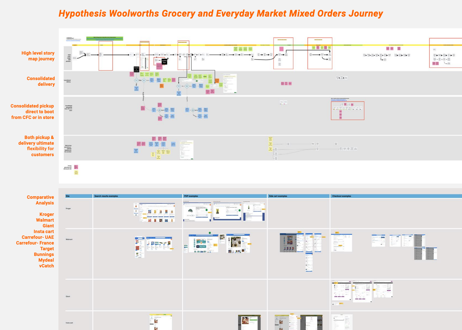
Discovery
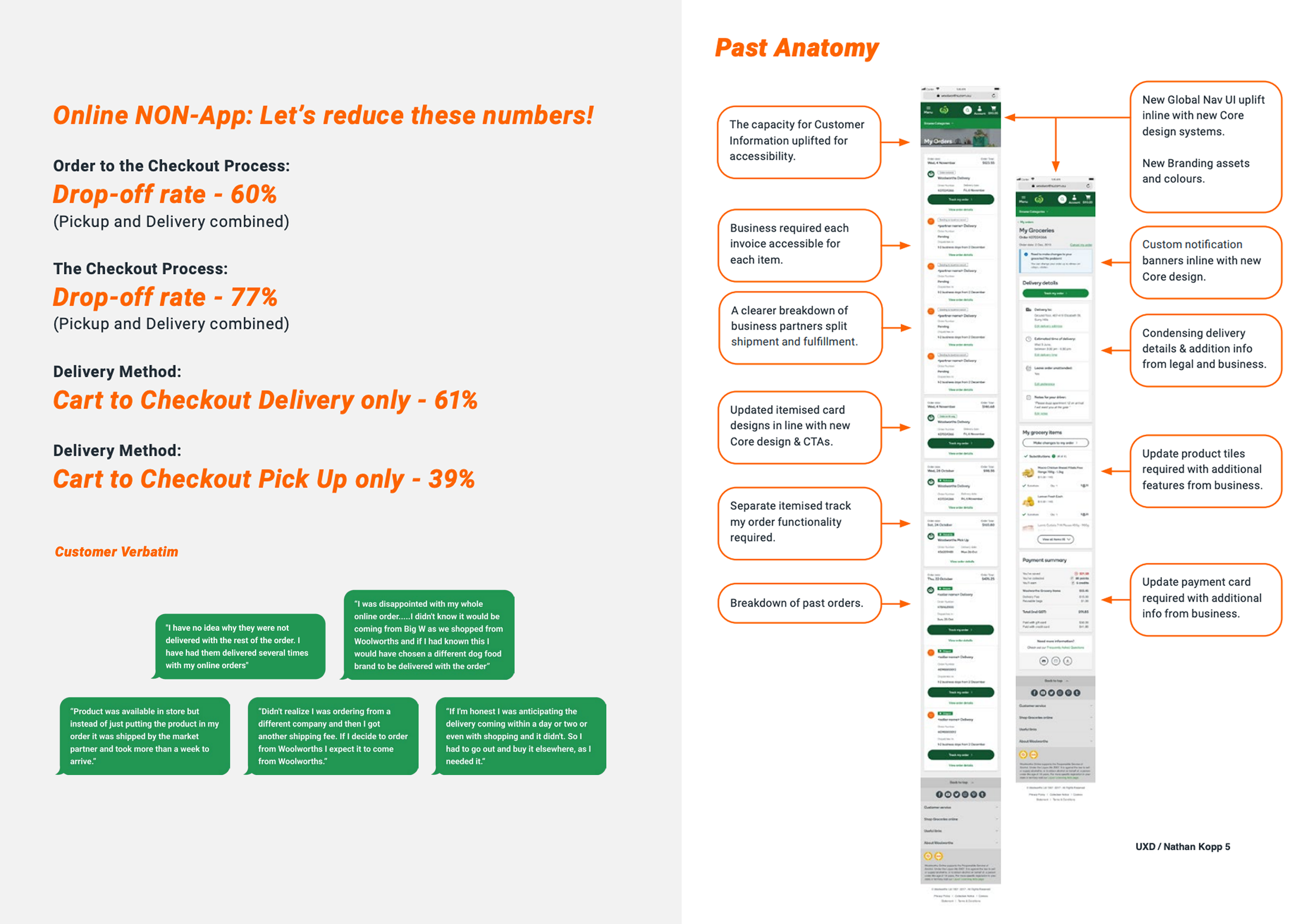
To understand where trust broke down, the team used a combination of discovery methods.
-
Voice of Customer insights
Mixed basket analysis
Customer journey mapping
-
Heuristic evaluation
Competitive analysis
Baymard research
-
Checkout drop-off analysis
Delivery behaviour
Customer support contact drivers
Three Experienced Problems
The project evolved through three major
improvements in experience.
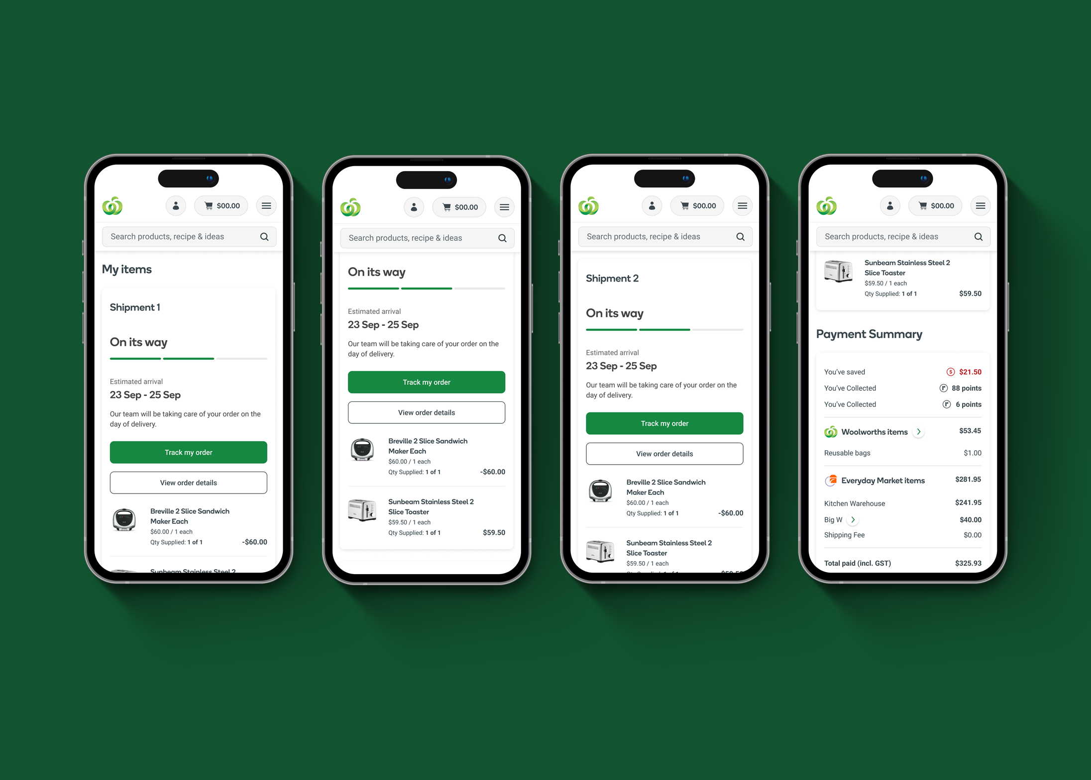
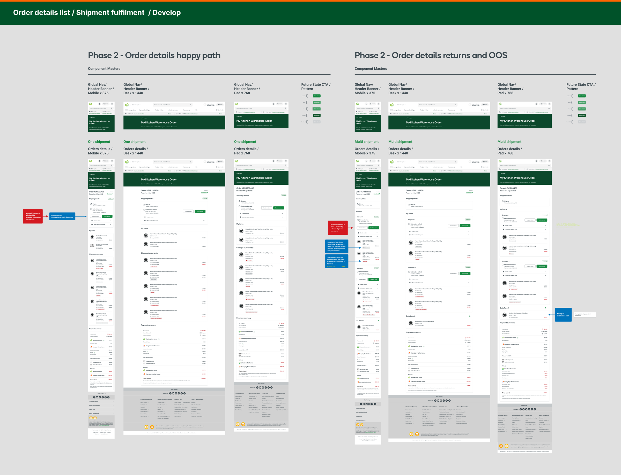
01: Multi-shipment fulfilment
Problem: Customers could not understand why items from the same basket arrived separately.
The existing experience treated split fulfilment as an exception.
-
We introduced a clearer fulfilment model.
-
Order #12345
Delivery status: Processing -
Order #12345
Shipment 1
Woolworths Grocery Arriving TomorrowShipment 2
Everyday Market Partner Arriving Later
Design Principles
Separate operational complexity from customer complexity.
Customers should understand what is happening without needing to understand why.
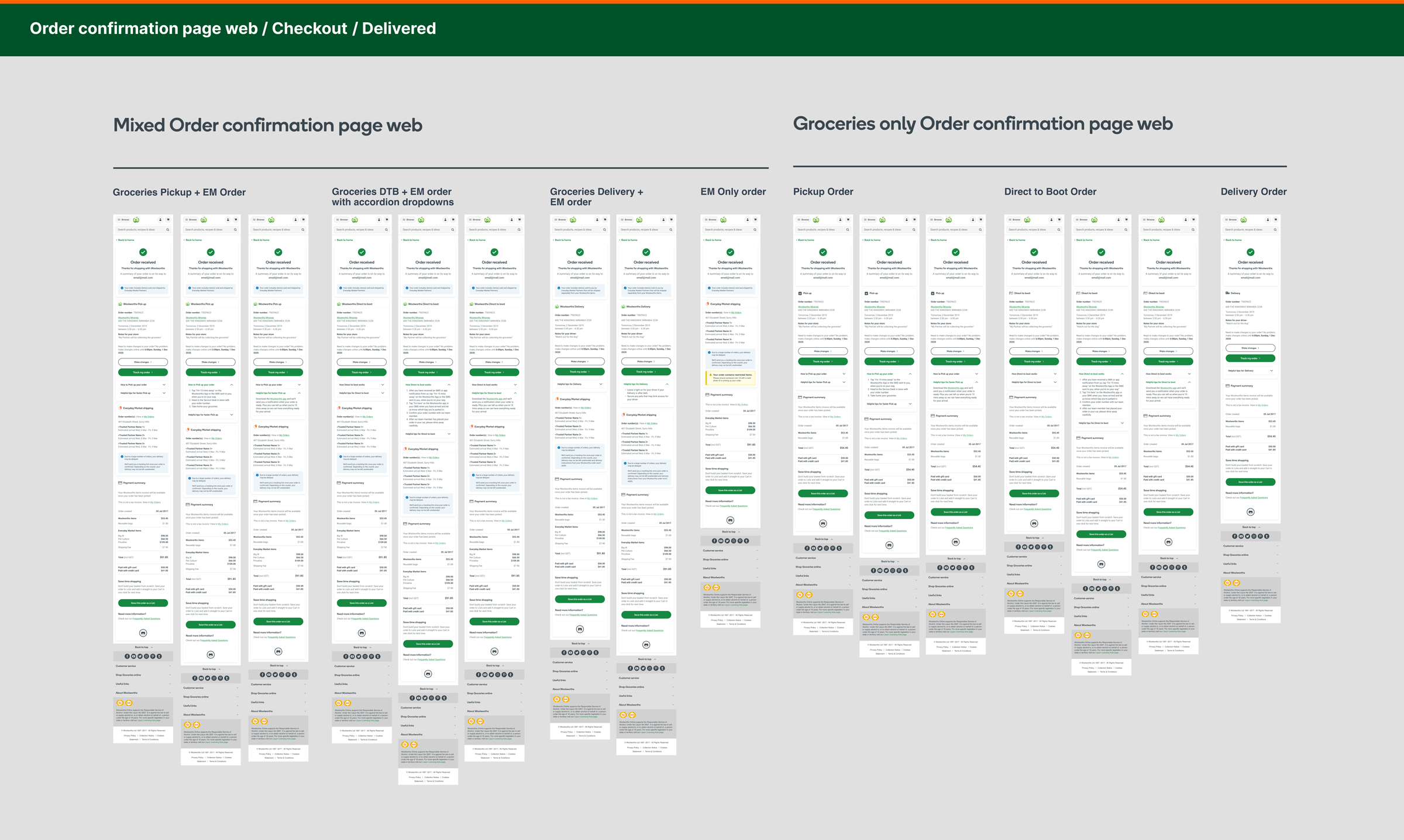
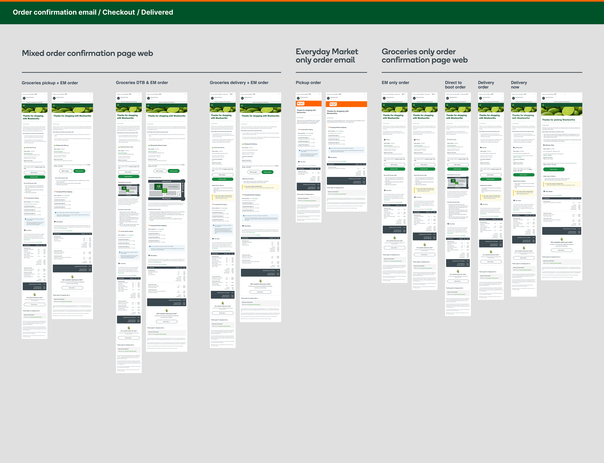
02: Mixed Order Confirmation
Problem: Customers purchasing Woolworths Grocery + Everyday Market items struggled to understand:
What was being delivered
When it would arrive
Why items behaved differently
This caused basket abandonment and confusion.
-
Created clearer order confirmation patterns:
Your order contains:
✓ Woolworths Grocery Delivery tomorrow
✓ Everyday Market Delivered separately

Outcome
Customers gained confidence immediately after checkout.
The experience reduced uncertainty at the
highest-risk moment.
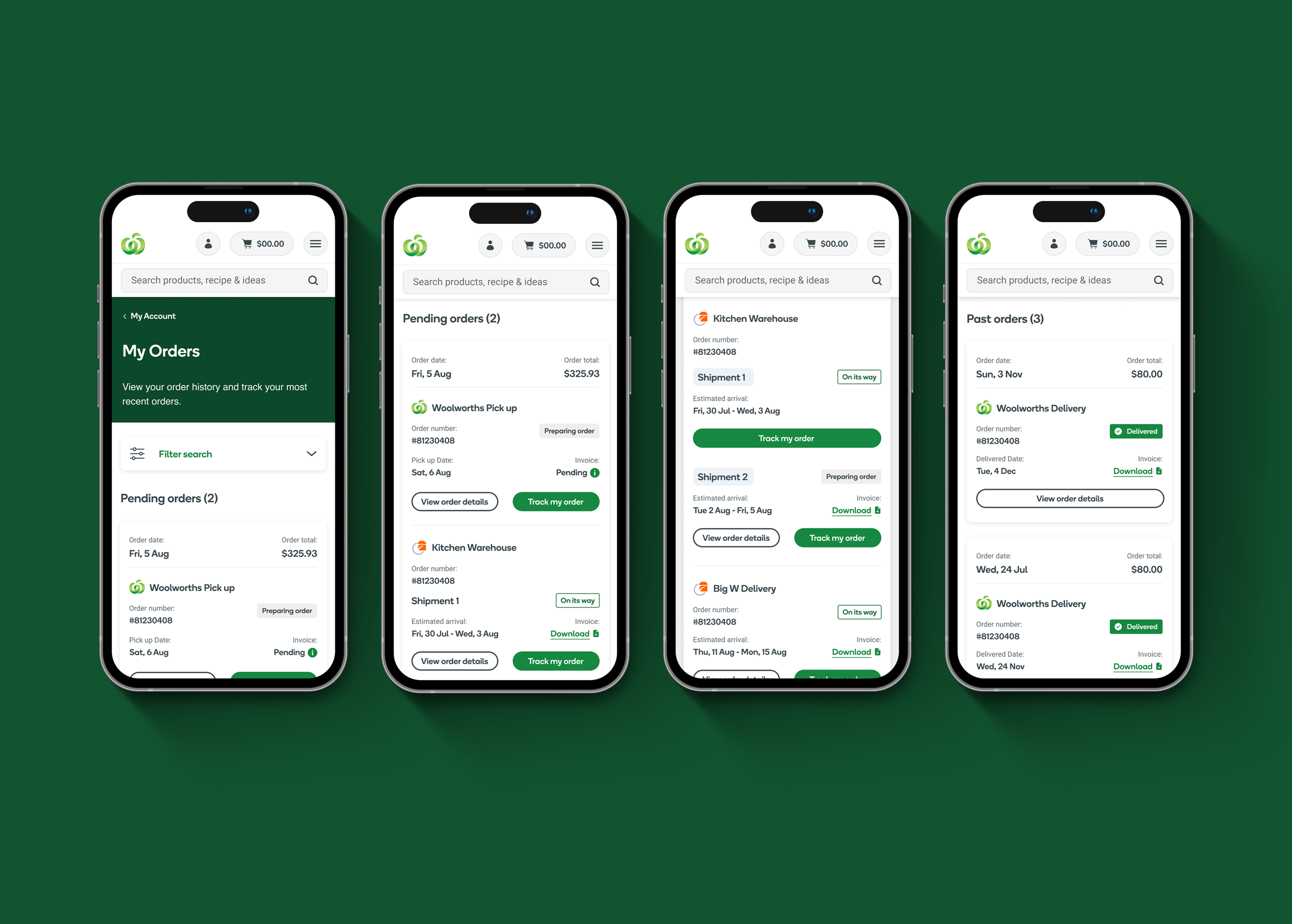
03: Order Tracking
Problem: Customers only saw a single order status.
However, the order could contain multiple fulfilment journeys.
This created:
"Where is my order?"
Support contacts
Reduced delivery satisfaction
-
Designed item-level order visibility.
Your Order Woolworths Grocery
✓ DeliveredEveryday Market
🚚 In Transit | Expected Friday


Conclusion
Simplified complexity across Woolworths Grocery and Everyday Market.
Balanced customer needs, business goals and technical constraints.
Improved fulfilment transparency across mixed orders.
Made order tracking and delivery expectations clearer.
Helped customers understand what they ordered, when it would arrive, and what happens next.
Reinforced the value of clear, connected end-to-end journeys in complex ecommerce ecosystems.
Key Learnings
Design for customers, not internal processes
Customers see one Woolworths experience, so the design needed to feel simple despite complex backend operations.Transparency builds trust
Clear delivery information helps customers feel confident and in control.Collaboration drives success
Working closely with product, engineering, legal, and operations teams was essential to creating a scalable solution.Test and iterate early
Continuous research and testing helped validate ideas and improve the final experience.Ultimately, this project reinforced that good design removes complexity and creates experiences that feel effortless.
CASE STUDY 02 | Ramsay Health Care
The Challenge
A fragmented healthcare digital ecosystem.
-
→ Users struggle to find information
-
→ Experience feels fragmented
-
→ Teams create inconsistently
-
→ Users work harder
-
→ Every change costs more

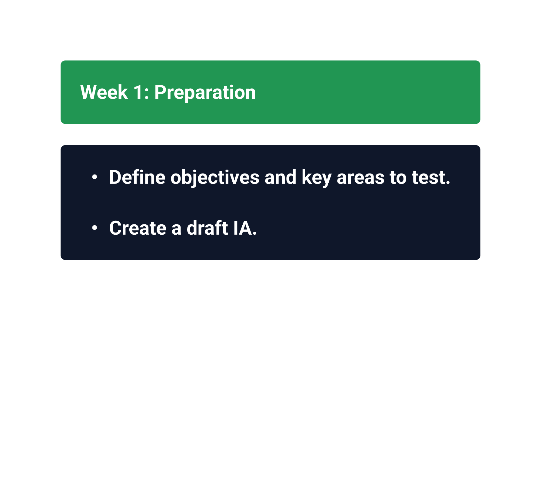
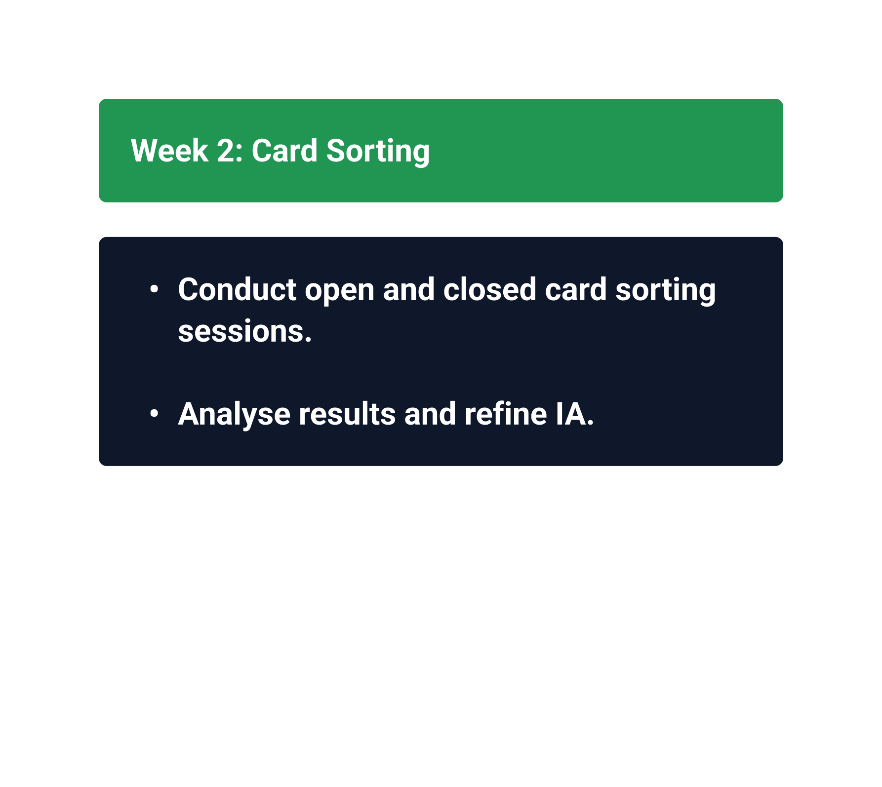
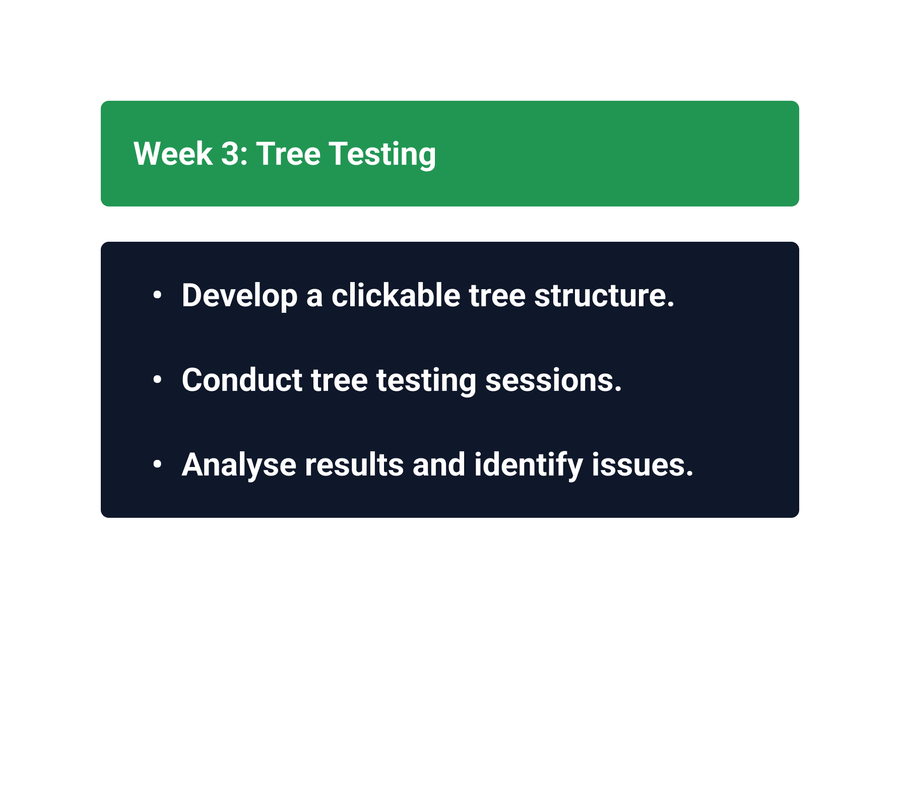
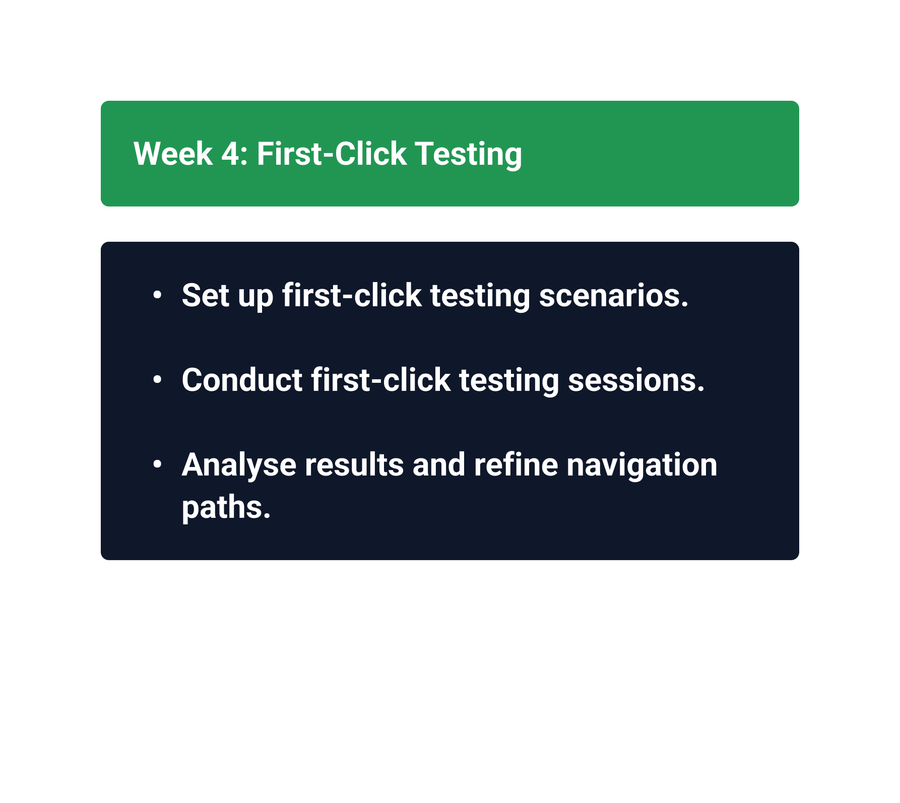
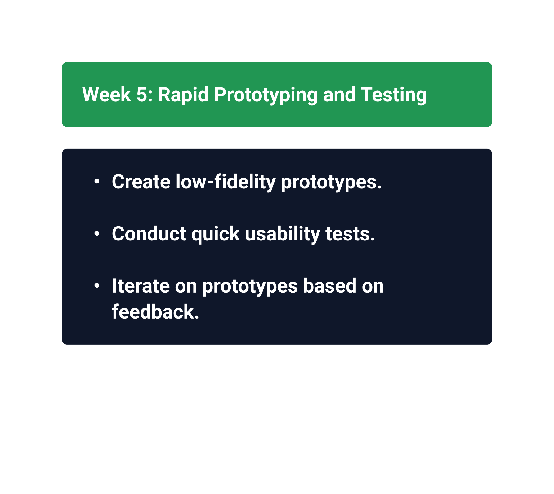
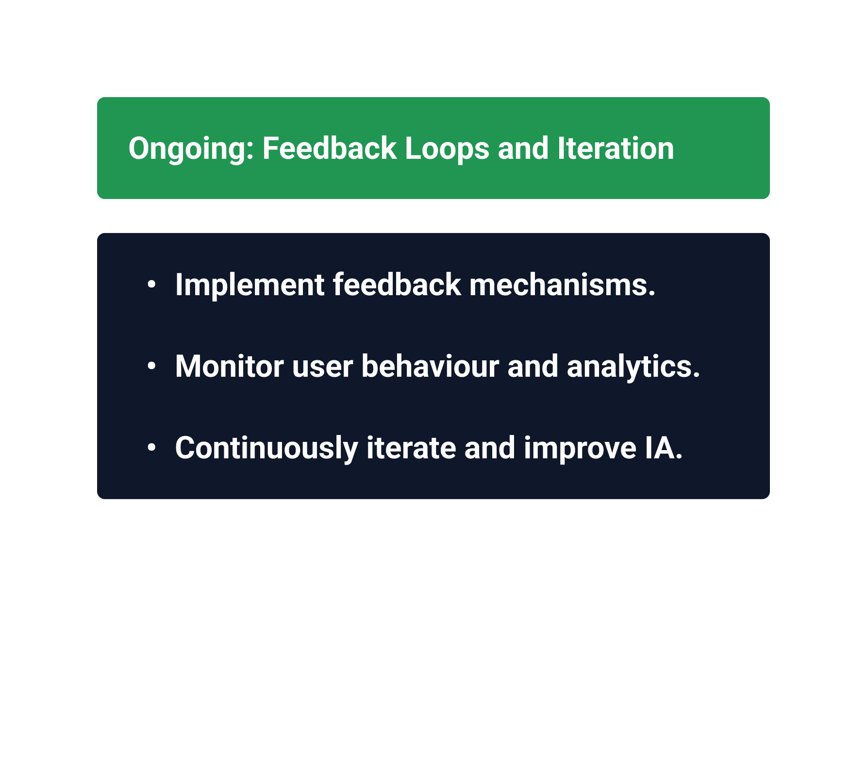
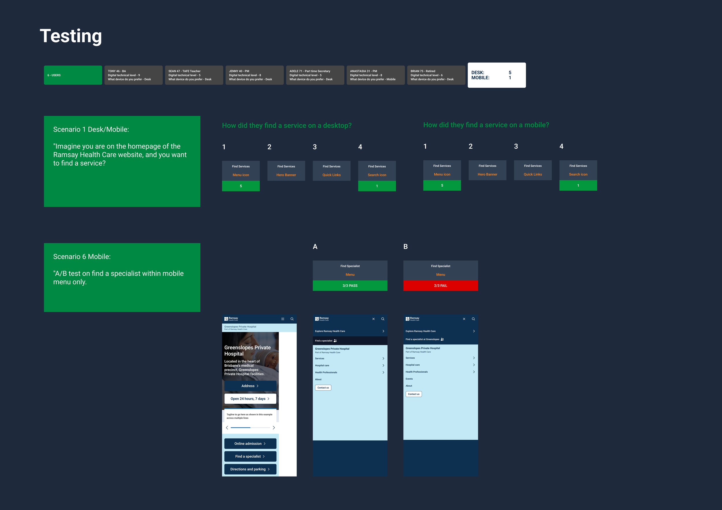
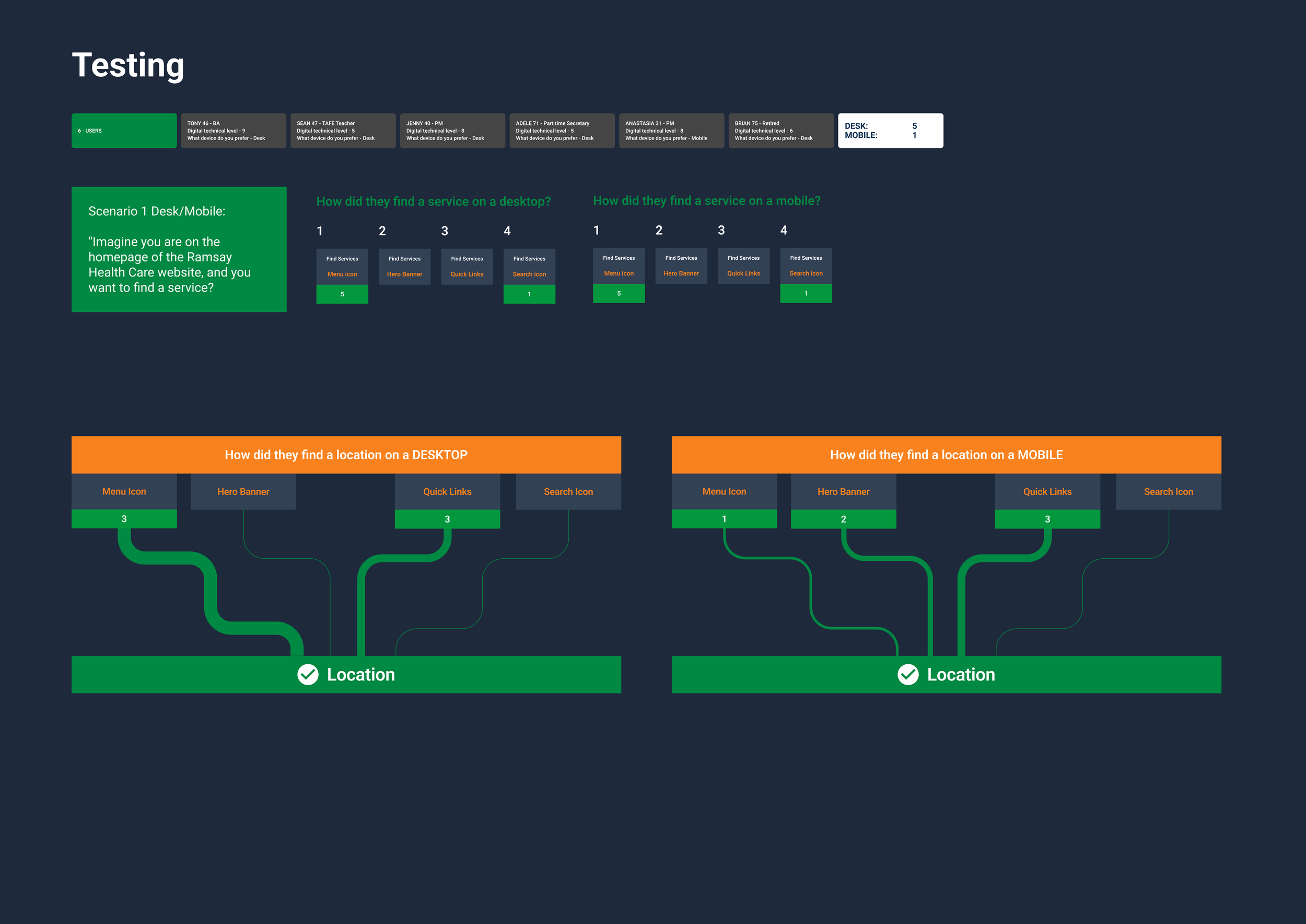
Information Architecture first
Structure before surface.
Understand business objectives
Identify priority user journeys
Audit existing content
Redesign IA
Test terminology and findability
Validate navigation
Then move into visual design
-
Find a hospital
Find a specialist
Find a service
Book an appointment
Understand treatment
Find quality & safety information
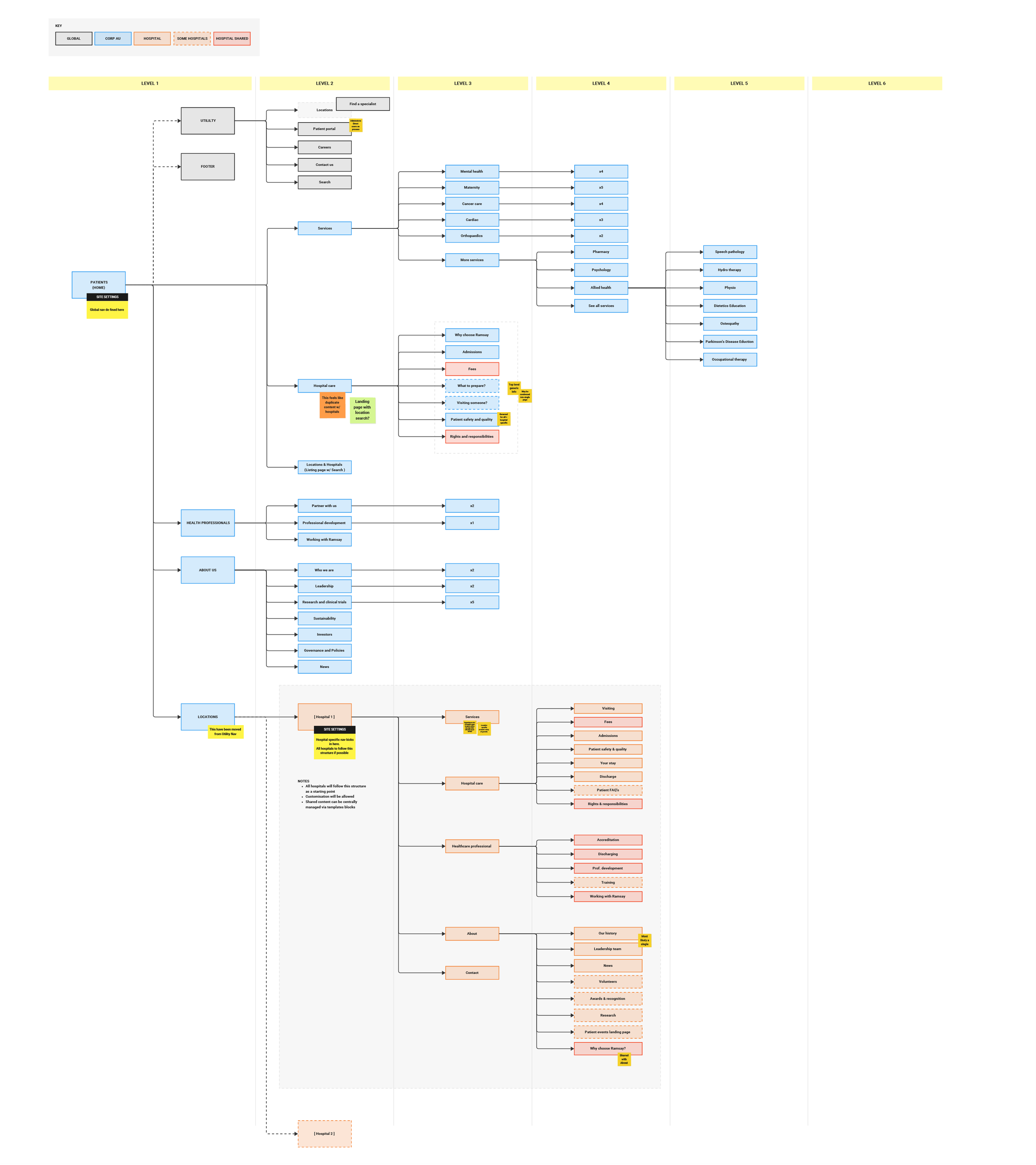
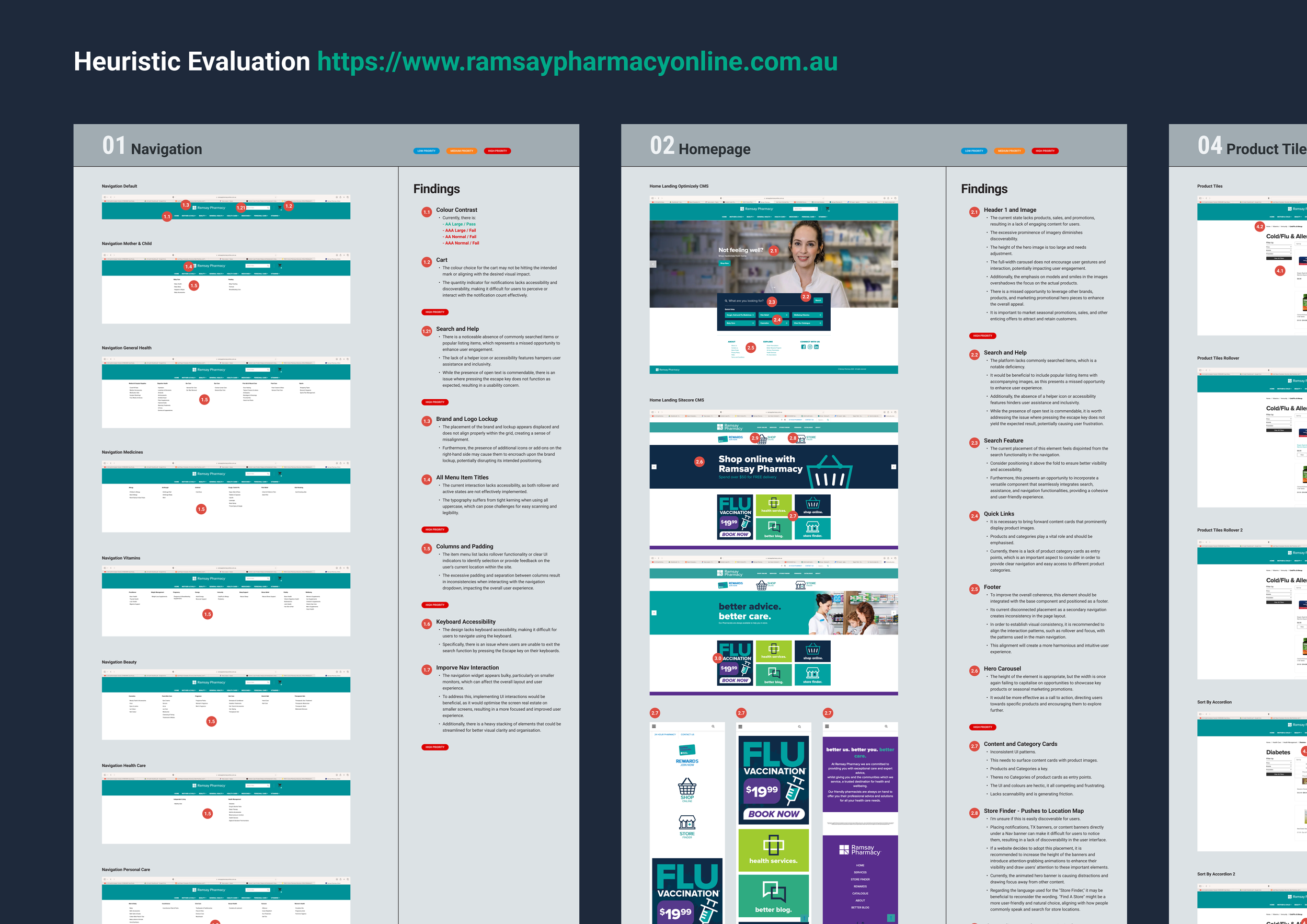
Information Architecture first

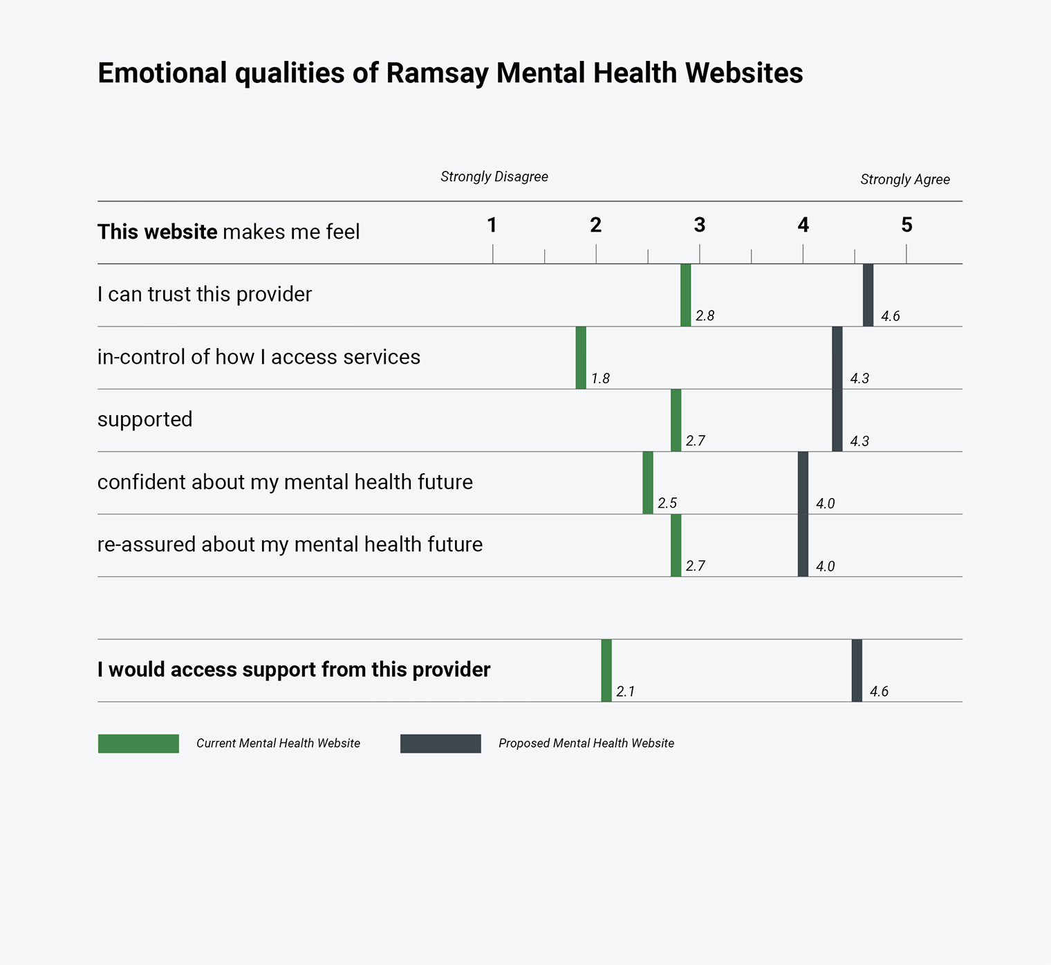
From brand to design system
Turning a brand into a digital system:
Brand
↓ Design foundations
↓ Tokens
↓ Components
↓ Patterns
↓ Templates
↓ Experiences
↓ Governance
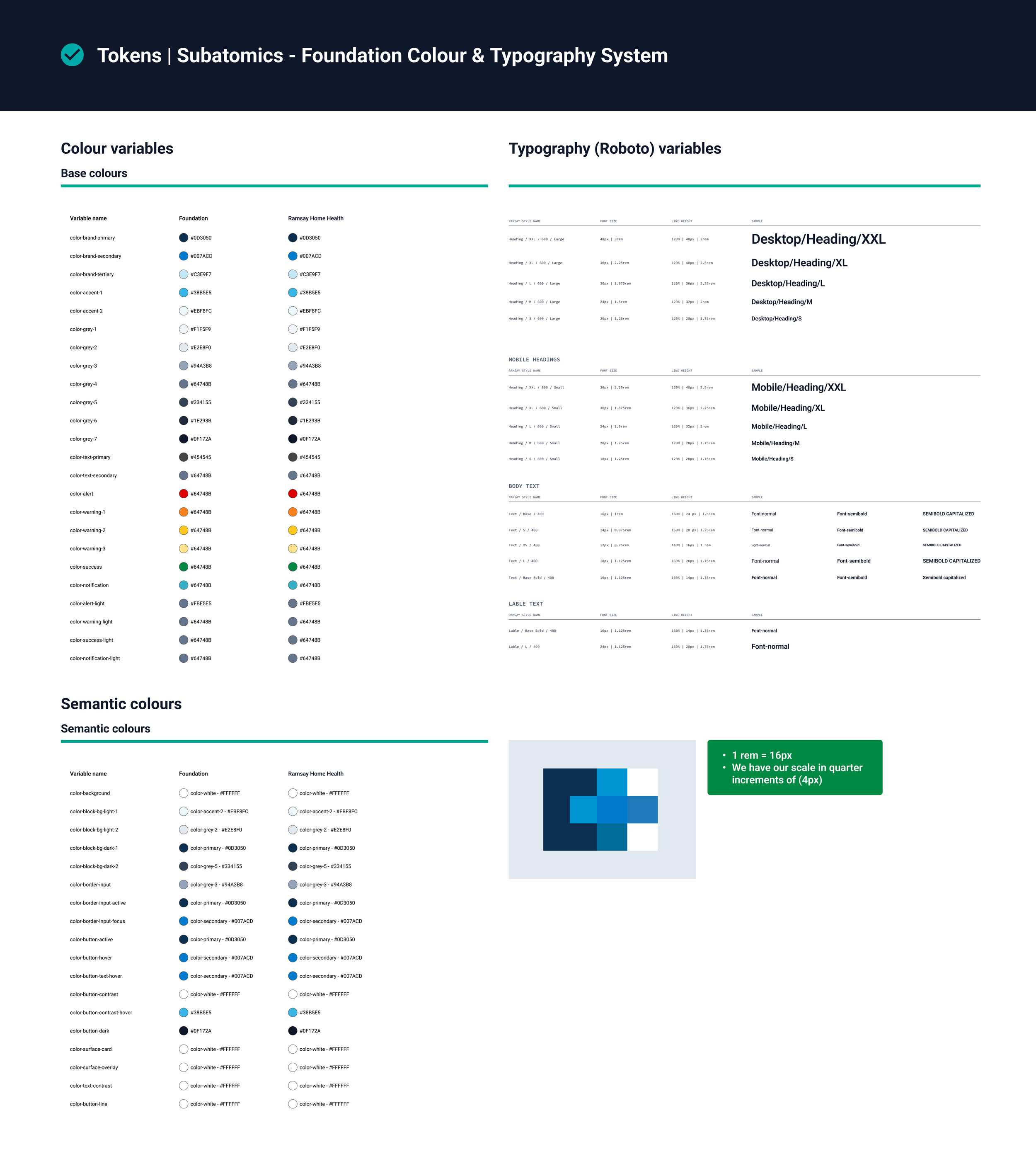
Tokens & Subatomic
-
![]()
Tokens Subatomics Foundation colour & typography System
-
![]()
Atoms icons

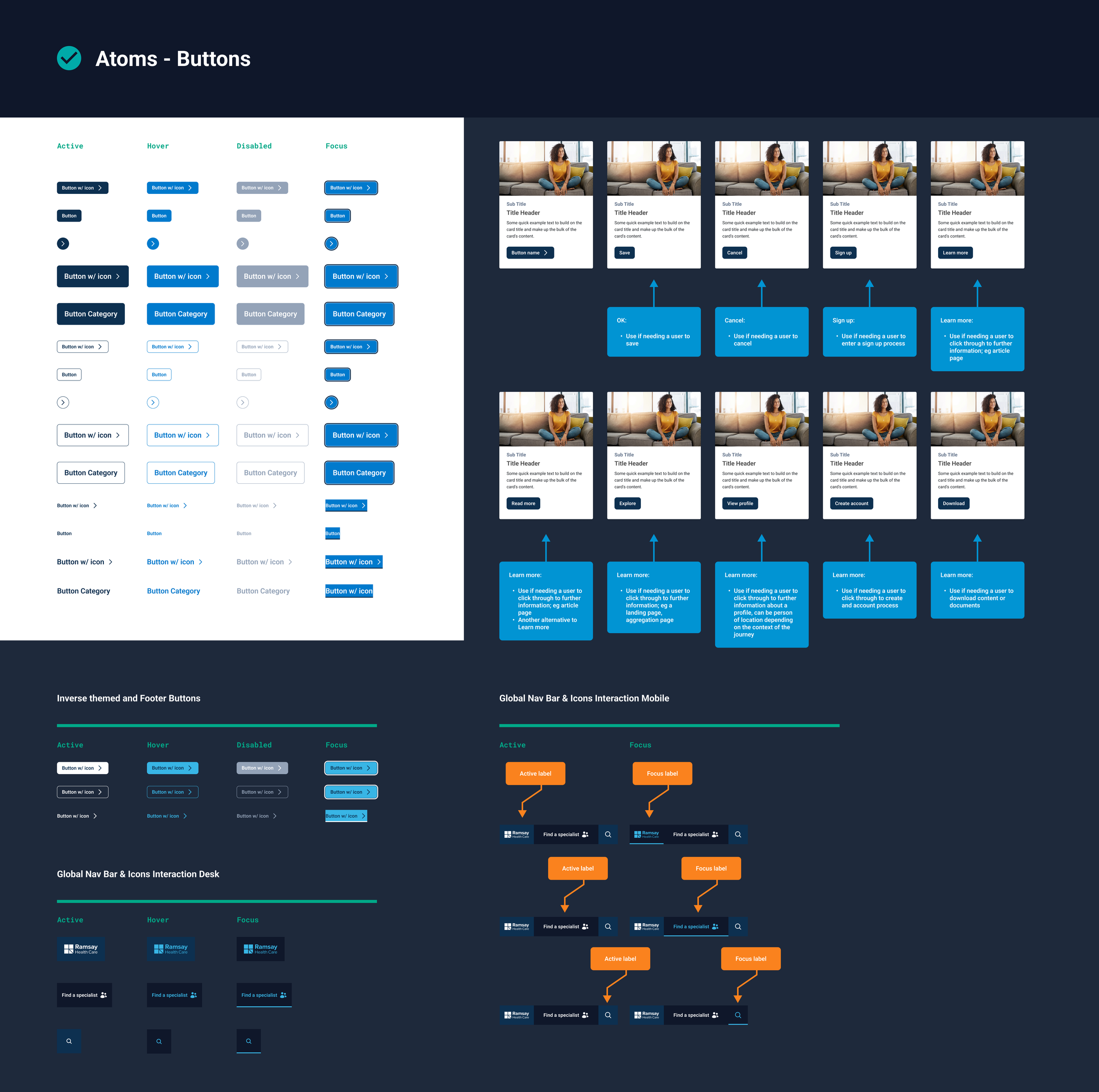
Atoms
-
![]()
Atoms Grids Foundation
-
![]()
Atoms Buttons
-
![]()
Atoms Icons
-
![]()
Atoms Icons Clinical Quality & Safety Results


Molecules
-
![]()
Molecules Forms
-
![]()
Molecules Organisms WYSIWYG Blocks Mobile
-
![]()
Molecules Organisms WYSIWYG Blocks Desk


Organisms
-
![]()
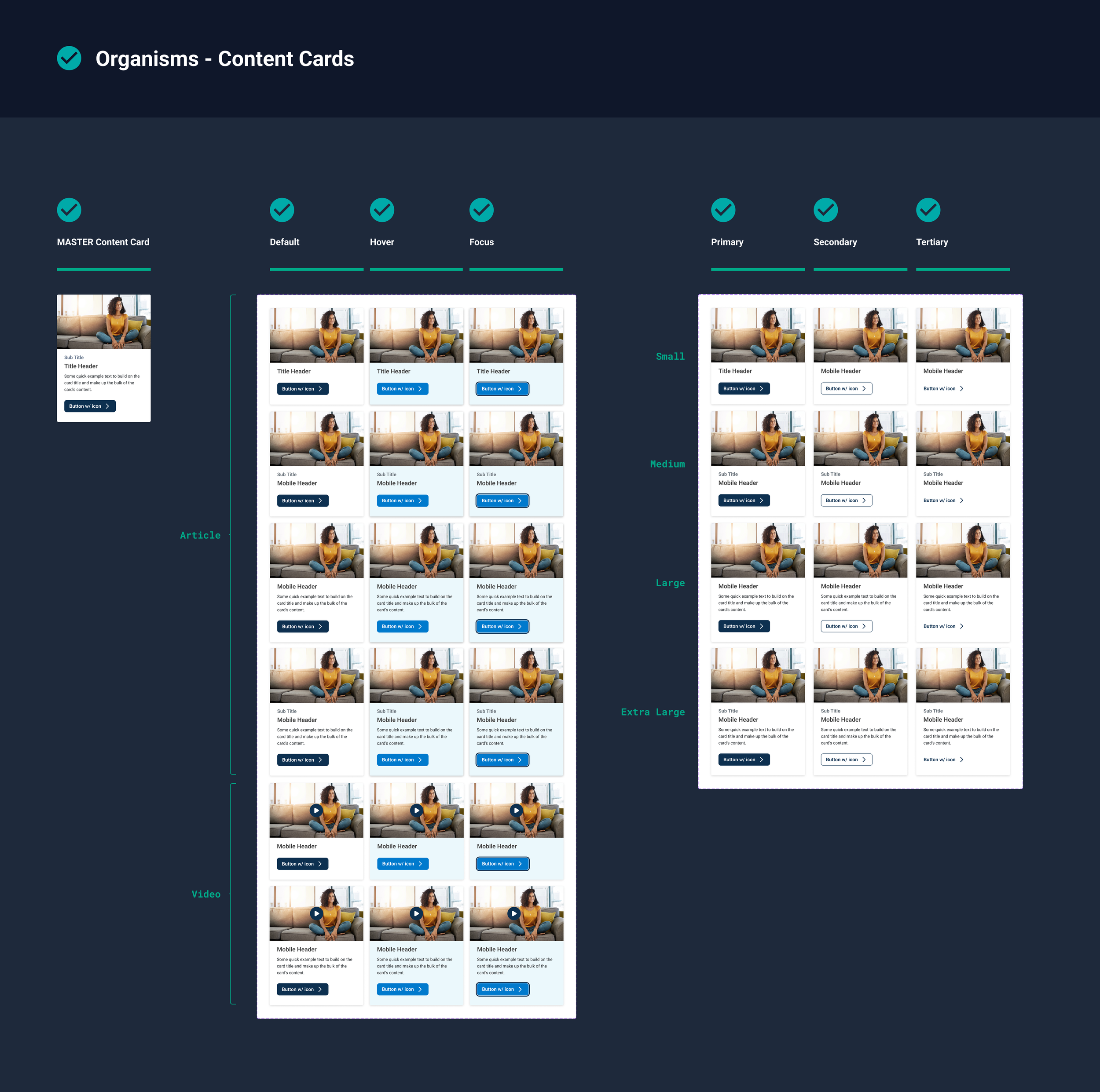
Organisms Content Cards
-
![]()
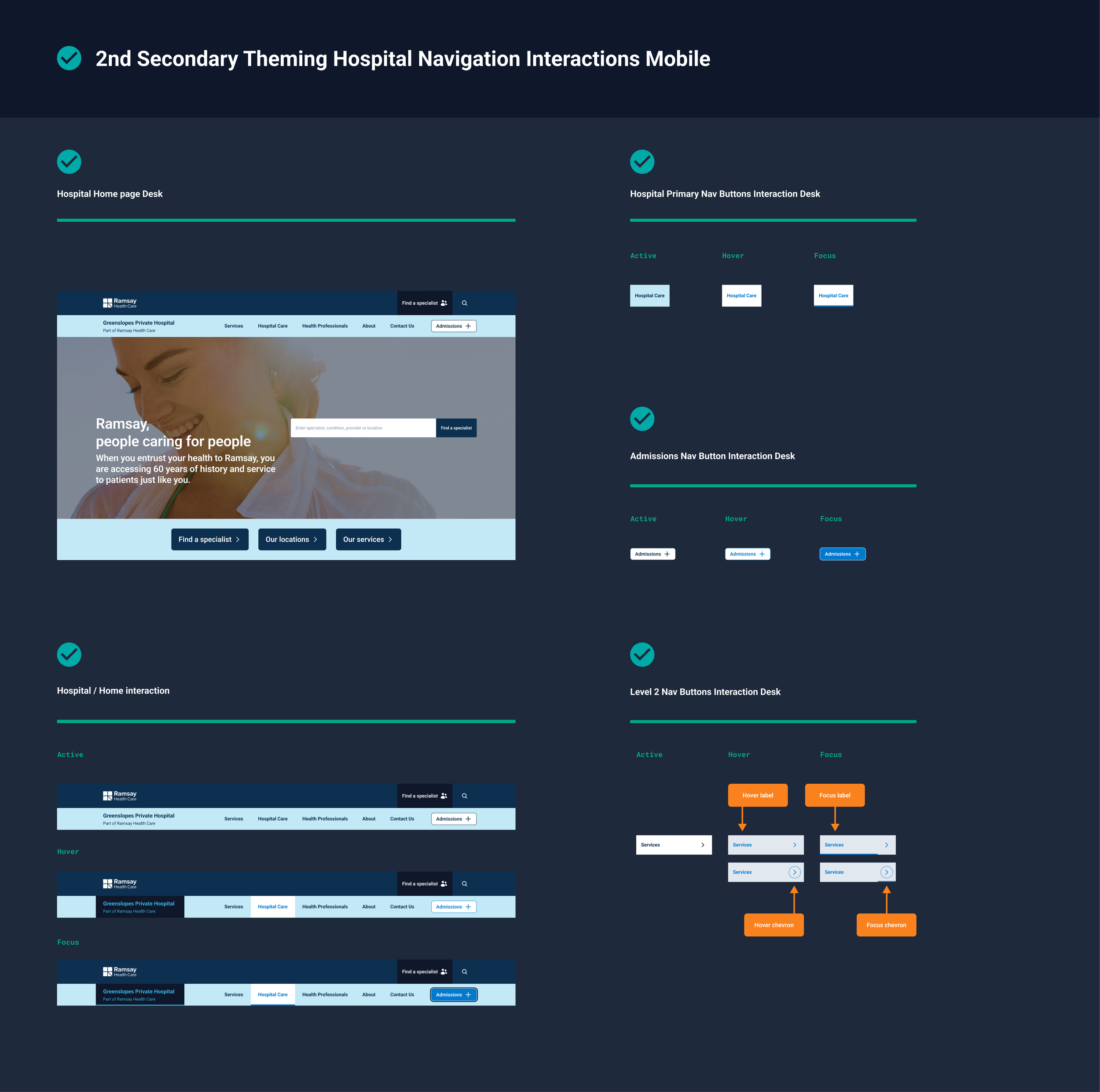
Secondary Theming Hospital Navigation Interactions Mobile
Templates
-
![]()
Templates Global Local
-
![]()
Hospital Local Solution & New Experience
-
![]()
Corporate Local Solution & New Experience


Pages
-
![]()
Pages Local
-
![]()
Pages Local


Ecosystem:
Global with Secondary Theming
-
![]()
Global Buttons & Logo Icons Interactions
-
![]()
Global Navigation Interactions
-
![]()
First Secondary Theming Corp Button & Icons Interactions Desk
-
![]()
First Secondary Theming Corp Button & Icons Interactions Mobile
-
![]()
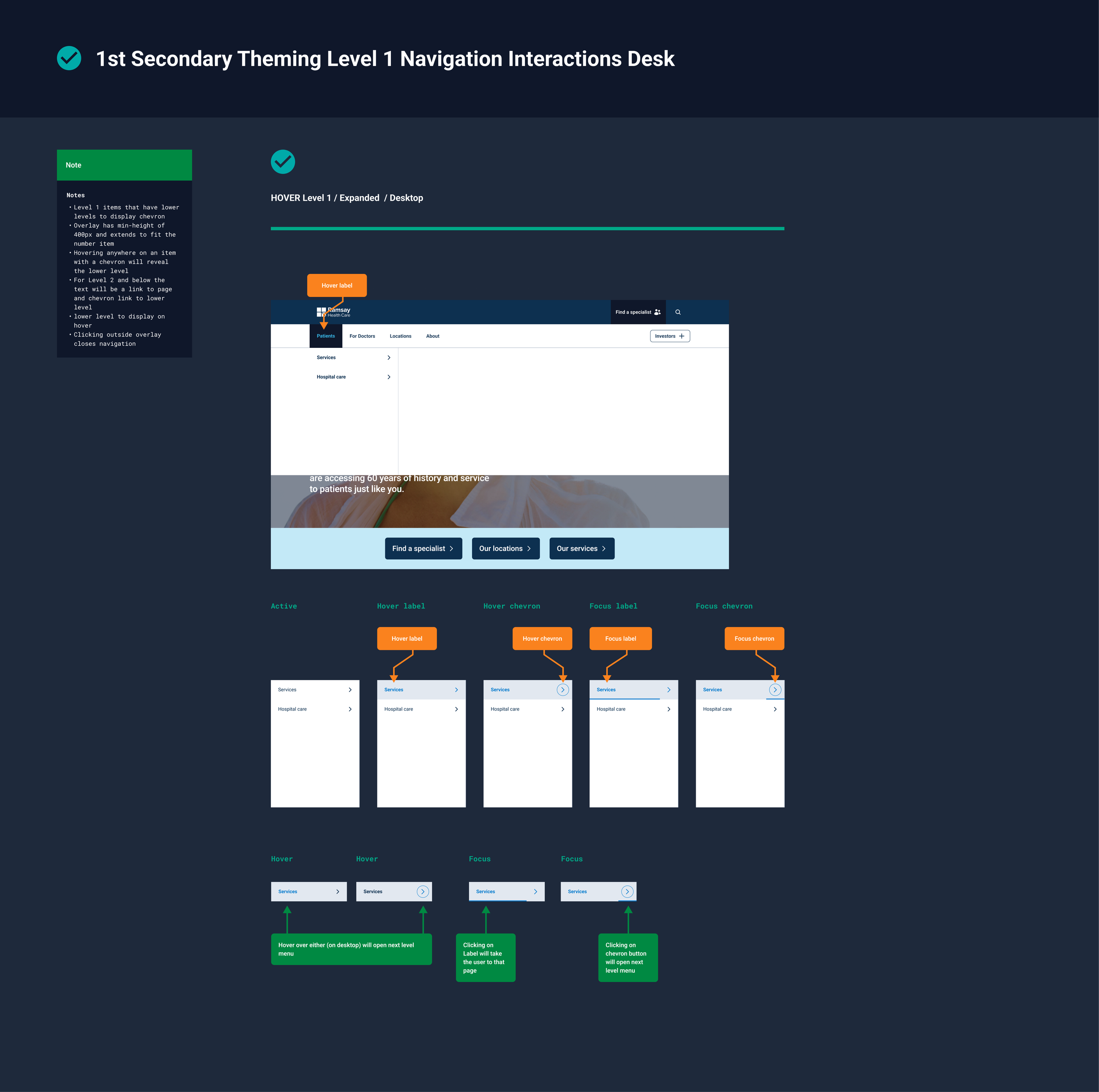
First Secondary Theming Level One Navigation Interactions Desk
-
![]()
First Secondary Theming Level 1/2/3 Navigation Interactions Desk
-
![]()
First Secondary Theming Level One Navigation Interactions Mobile
-
![]()
First Secondary Theming Level 2/3 Navigation Interactions Mobile




Ecosystem:
Local with Secondary Theming
-
![]()
Secondary theming hospital navigation interactions mobile
-
![]()
Secondary theming hospital navigation level 2 mobile
-
![]()
Secondary theming hospital navigation interactions desk
-
![]()
Secondary theming hospital navigation level 2 desk
-
![]()
Secondary theming hospital navigation interactions mobile
-
![]()
Secondary theming hospital navigation interactions desk


Designing for scale
Three pillars:
A design system isn't a library of components. It's a way of making better decisions repeatedly.
-
Shared components, patterns and interaction models.
-
Local teams could adapt experiences without breaking the system.
-
Documentation, contribution models, naming, accessibility and design reviews.
Conclusion & Learnings
Unified Experiences: Connected corporate and hospital journeys through a shared IA and navigation model.
Accessibility Through Consistency: Consistent patterns improved usability and accessibility across experiences.
Governance Enables Scale: Clear rules and reusable components supported sustainable digital growth.
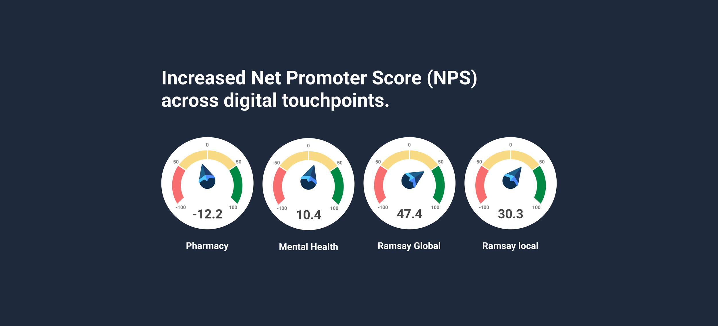
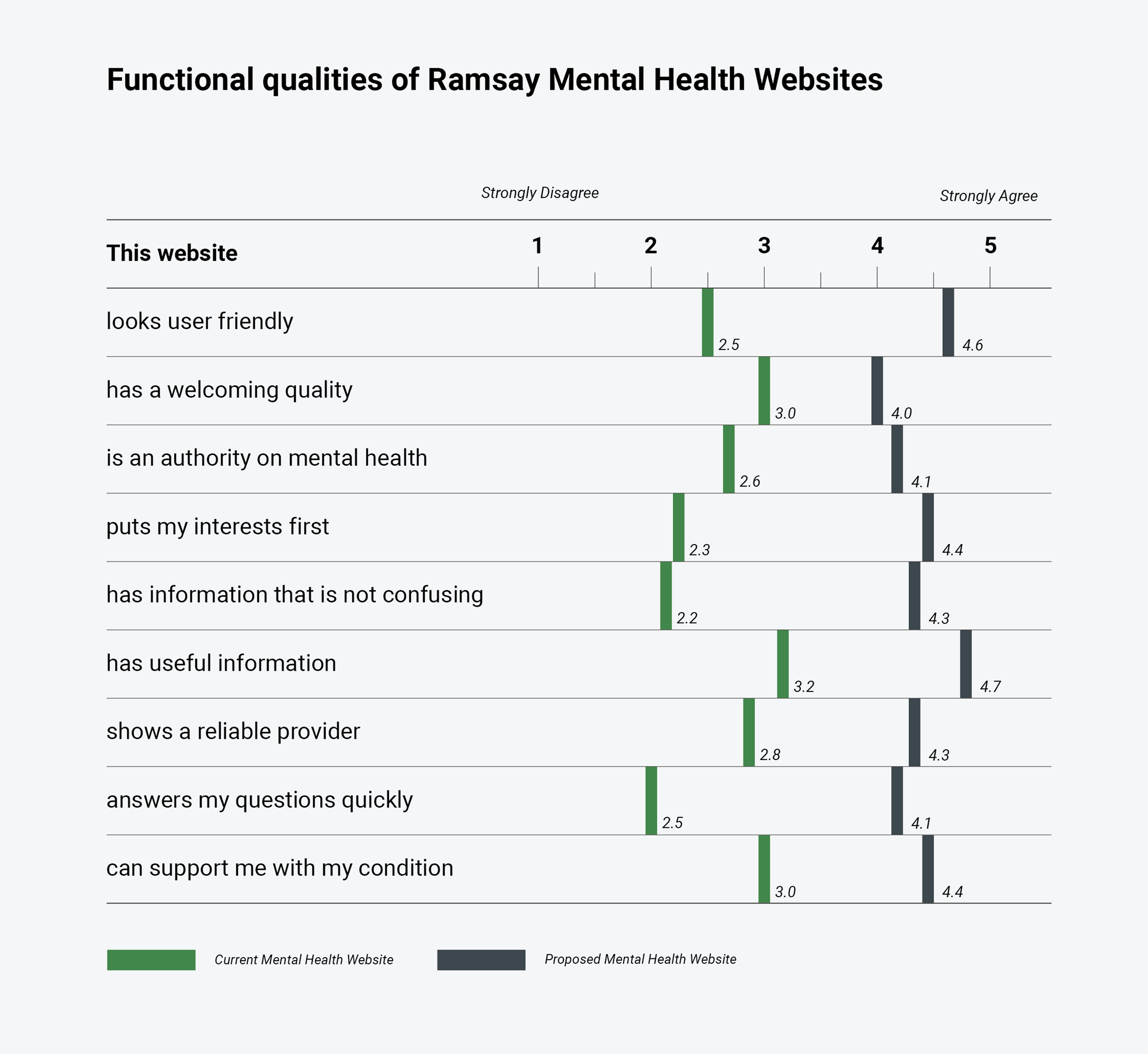
Research Drives Better Outcomes: Testing and validation helped refine IA and design decisions.
Design Systems Connect Brand & Product: GEL aligned brand, UX, UI and content into one scalable ecosystem.
Case Study 01: CI&T / Infomedia
The Challenge
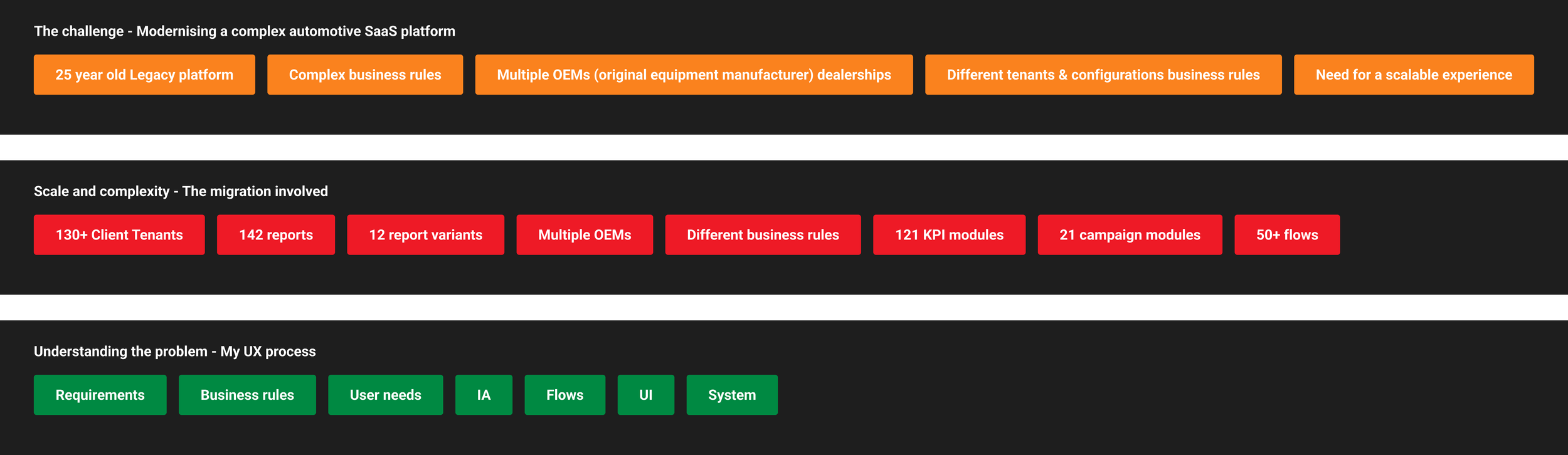
Modernising a complex automotive SaaS platform.
Project Overview
Infomedia provides SaaS solutions for automotive manufacturers and dealerships, helping them manage operational performance, report KPIs, and gain marketing insights.
-
Senior Lead Product Designer Responsible For
Discovery and requirements analysis
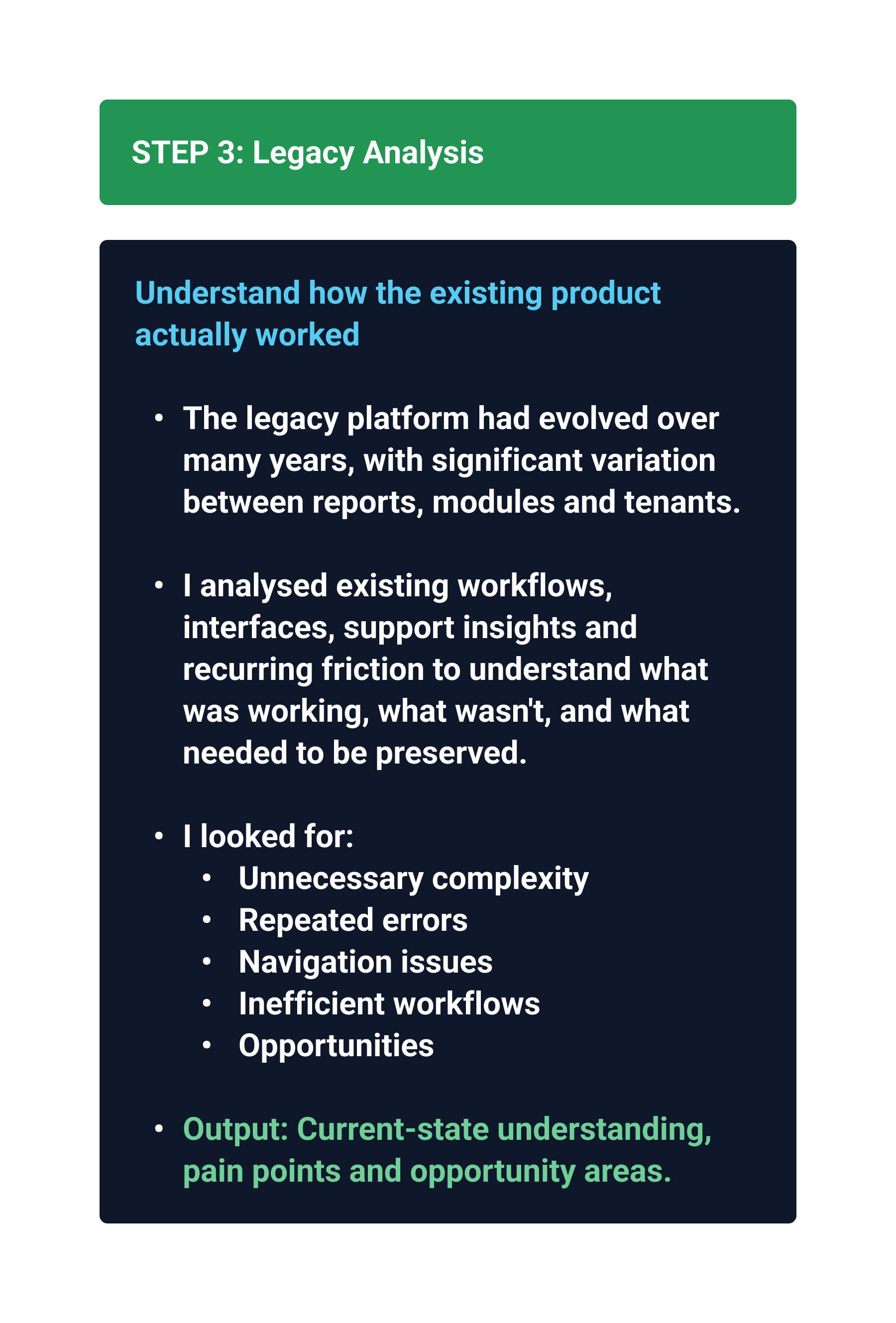
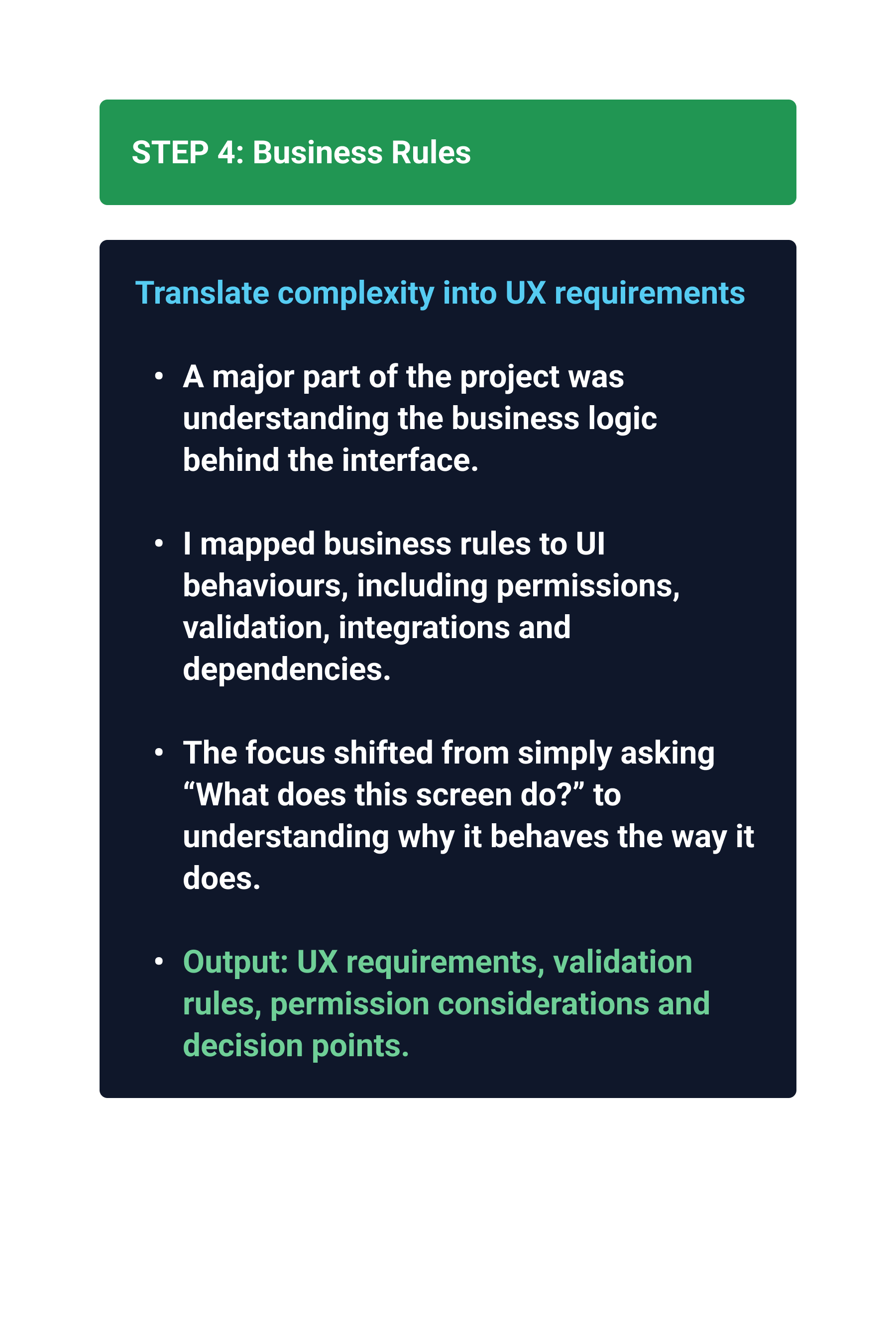
Reverse engineering existing experiences
Defining UX patterns
Defining and aligning the design system implementation
Creating scalable dashboard and reporting frameworks
-
• Audi
• Mitsubishi
• Suzuki
• Dealerships networks
-
Focused on migrating key reporting capabilities from a legacy platform to a modern architecture while improving usability and consistency.
-
Reporting
Dashboards
Performance Insights
Dealer KPI modules
-
The Migration Involved:
142 report variations
21 Dealer KPI modules
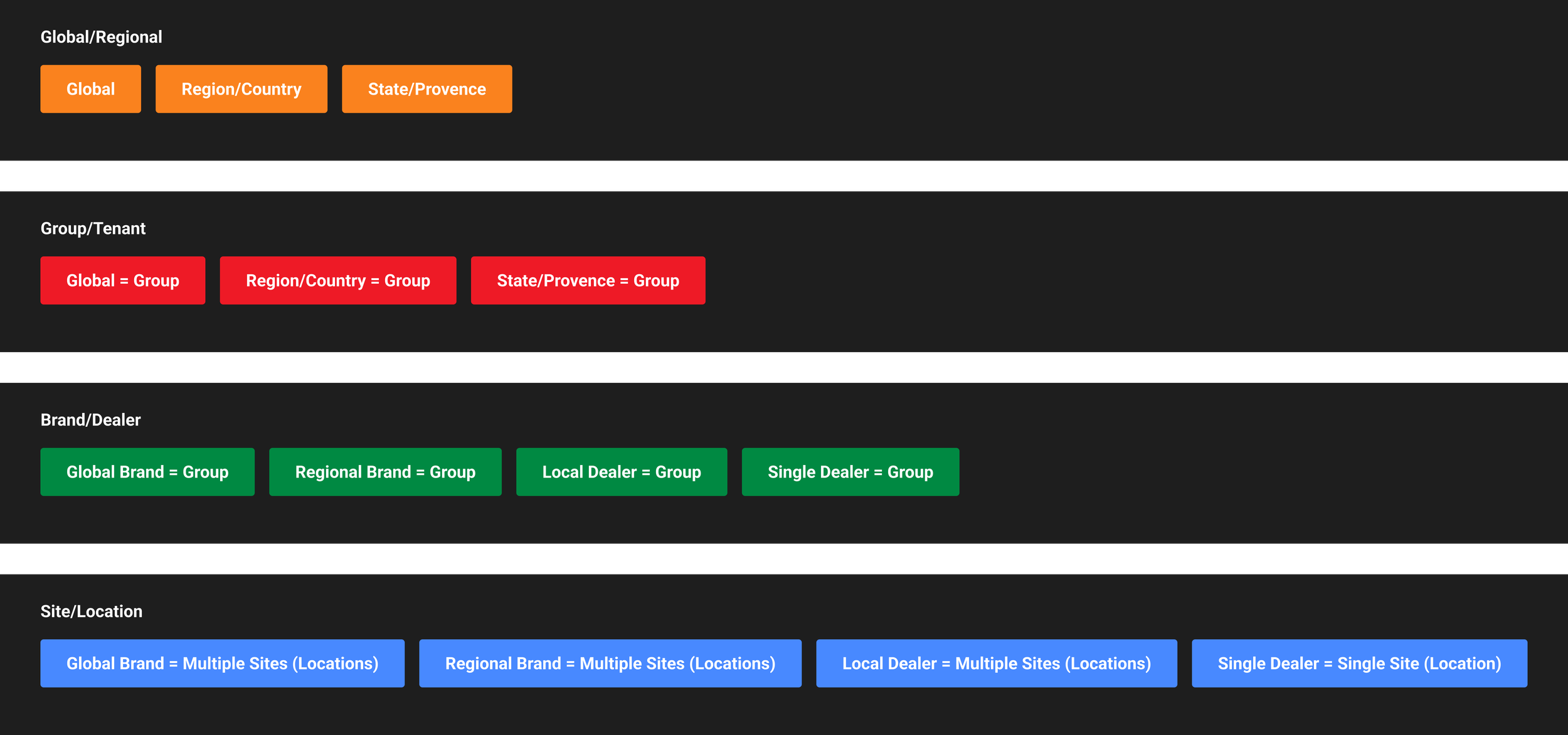
30 client tenants
Tenant-specific business logic
Different KPI calculations
Custom report configurations
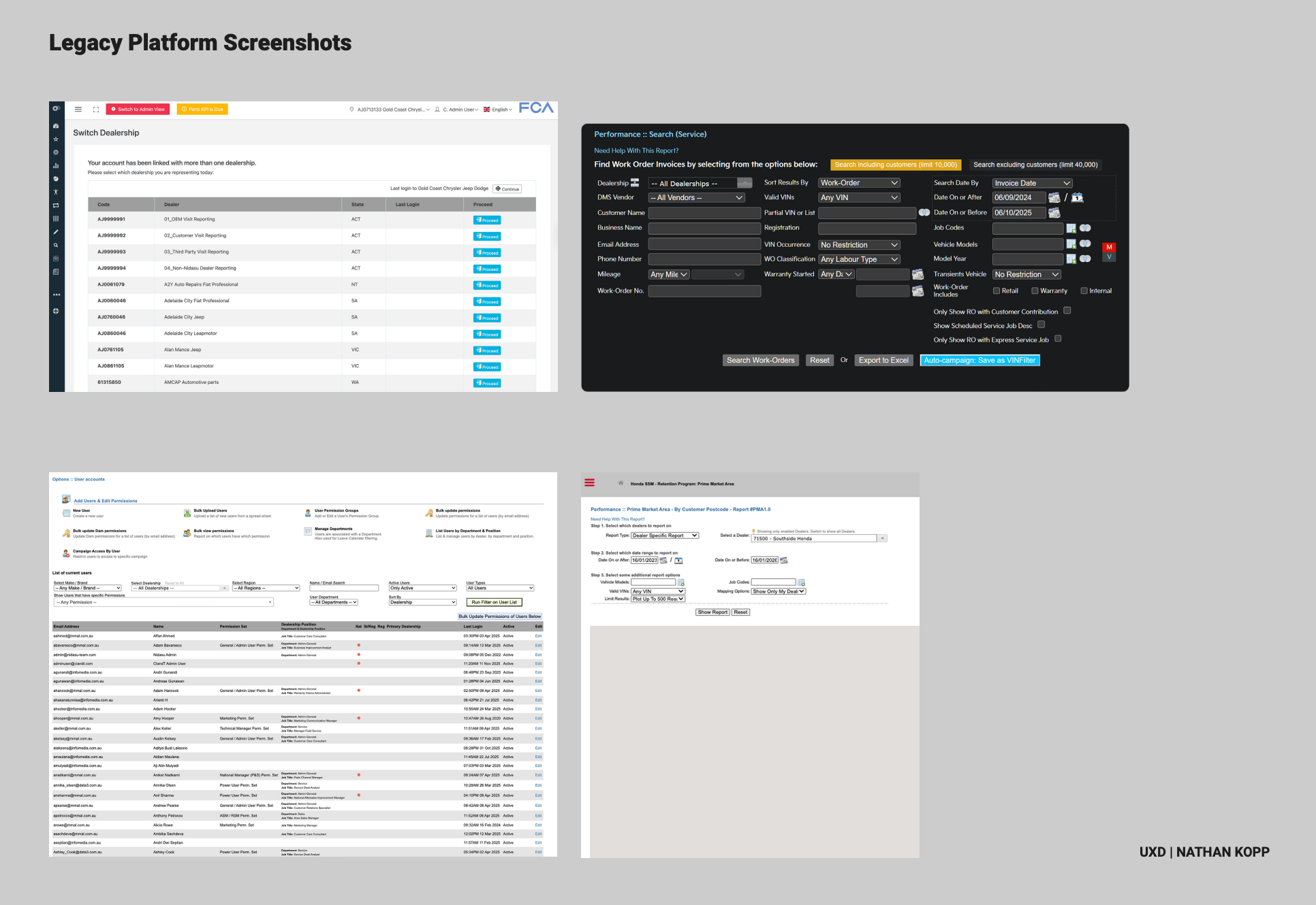
Legacy UI inconsistencies
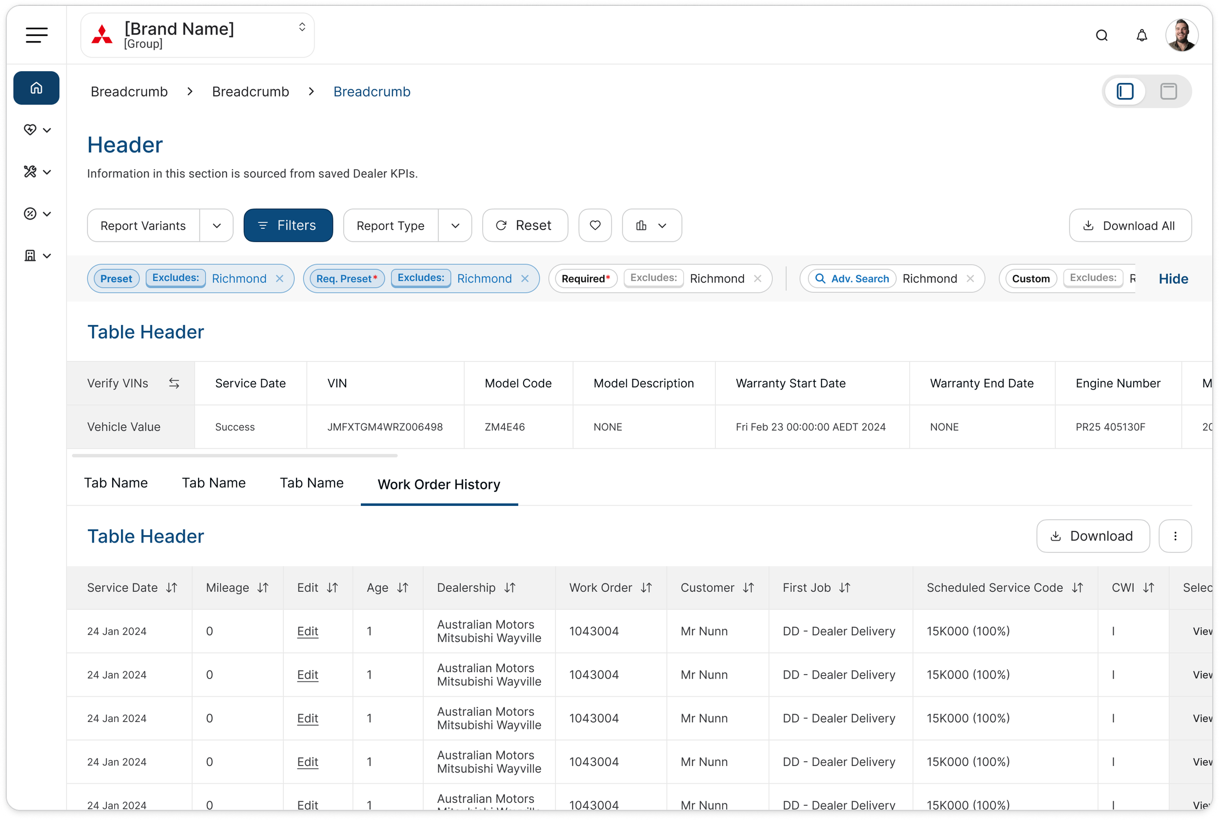
The Business Structure
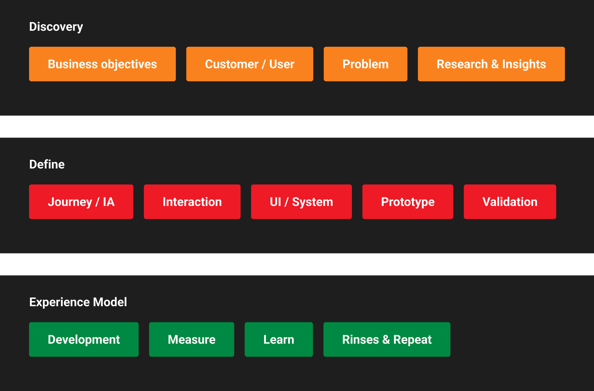
Discovery
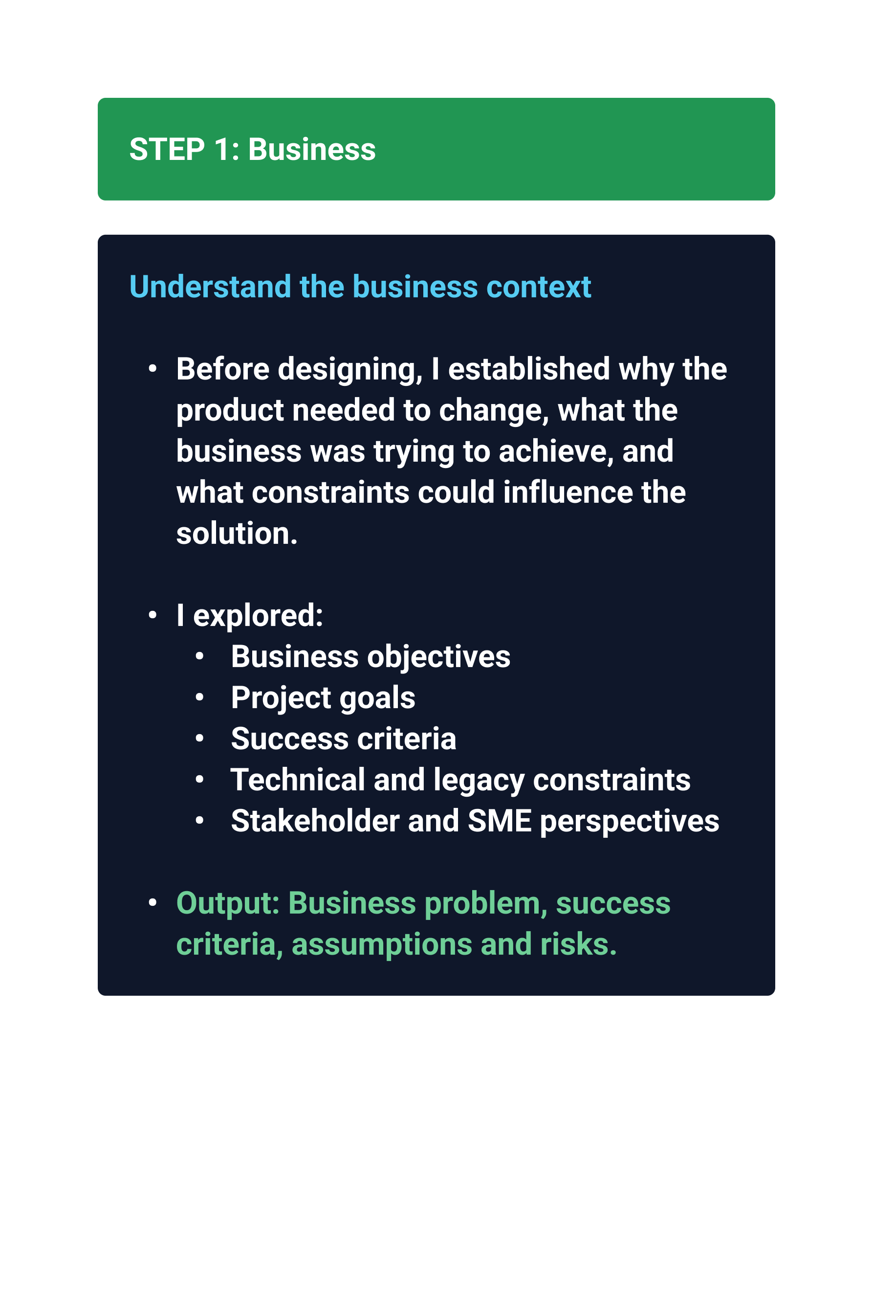
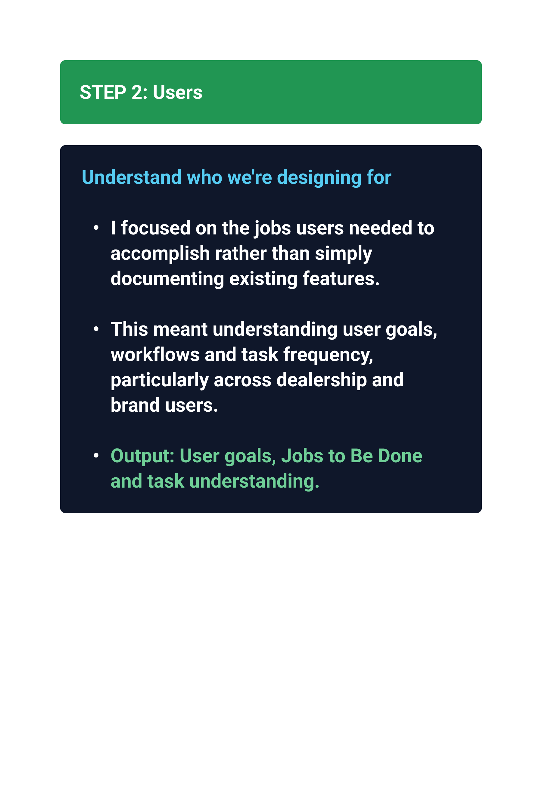
Before the team could begin any redesign, it needed to understand how the platform actually worked.
-
Understand the Business Context Activities
Review the BRD (Business Requirements
Document) and project goals
Understand why the modules exist
Identify business objectives and success criteria
Understand constraints (technical, regulatory, legacy)
Meet with the Product Manager, Engineering and SMEs
-
What problem are we solving?
Why now?
Who are we solving it for?
What does success look like?
What constraints do we have?
-
Business Problem Statement
Success Metrics: Improve task efficiency.
Reduce user errors, increase task success
Success: improve accessibility
Preserve user familiarity
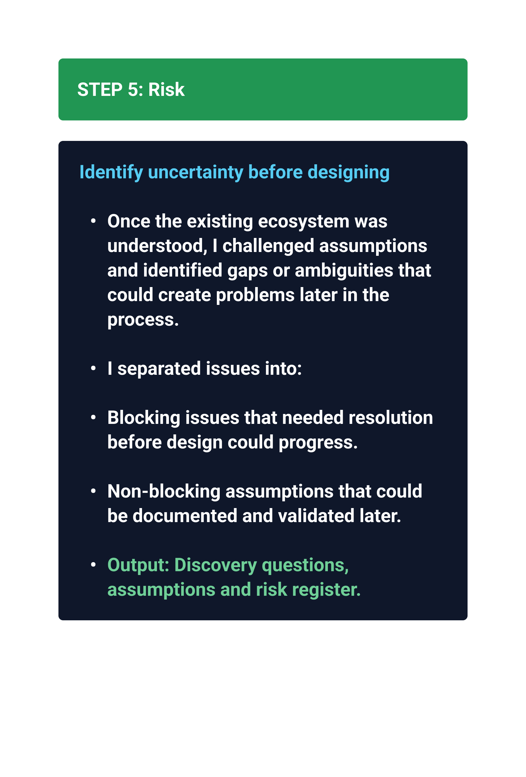
Clarify assumptions
Understand risks
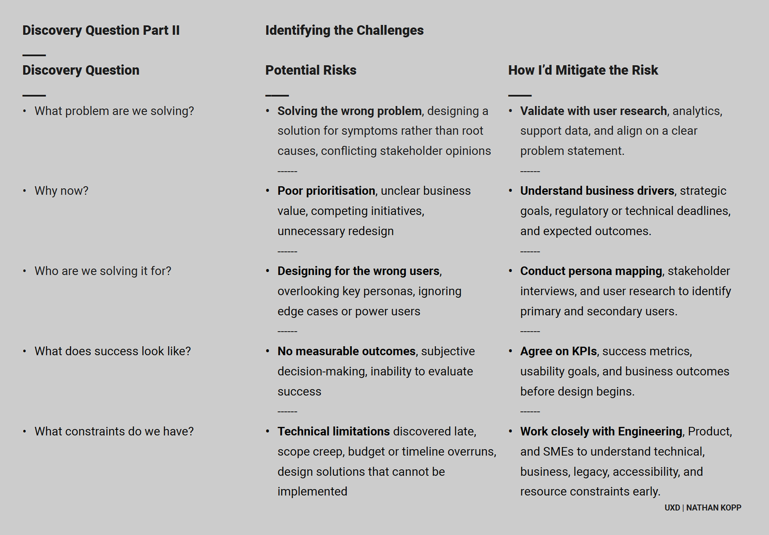
Design Thinking
Reverse Engineering Before Design
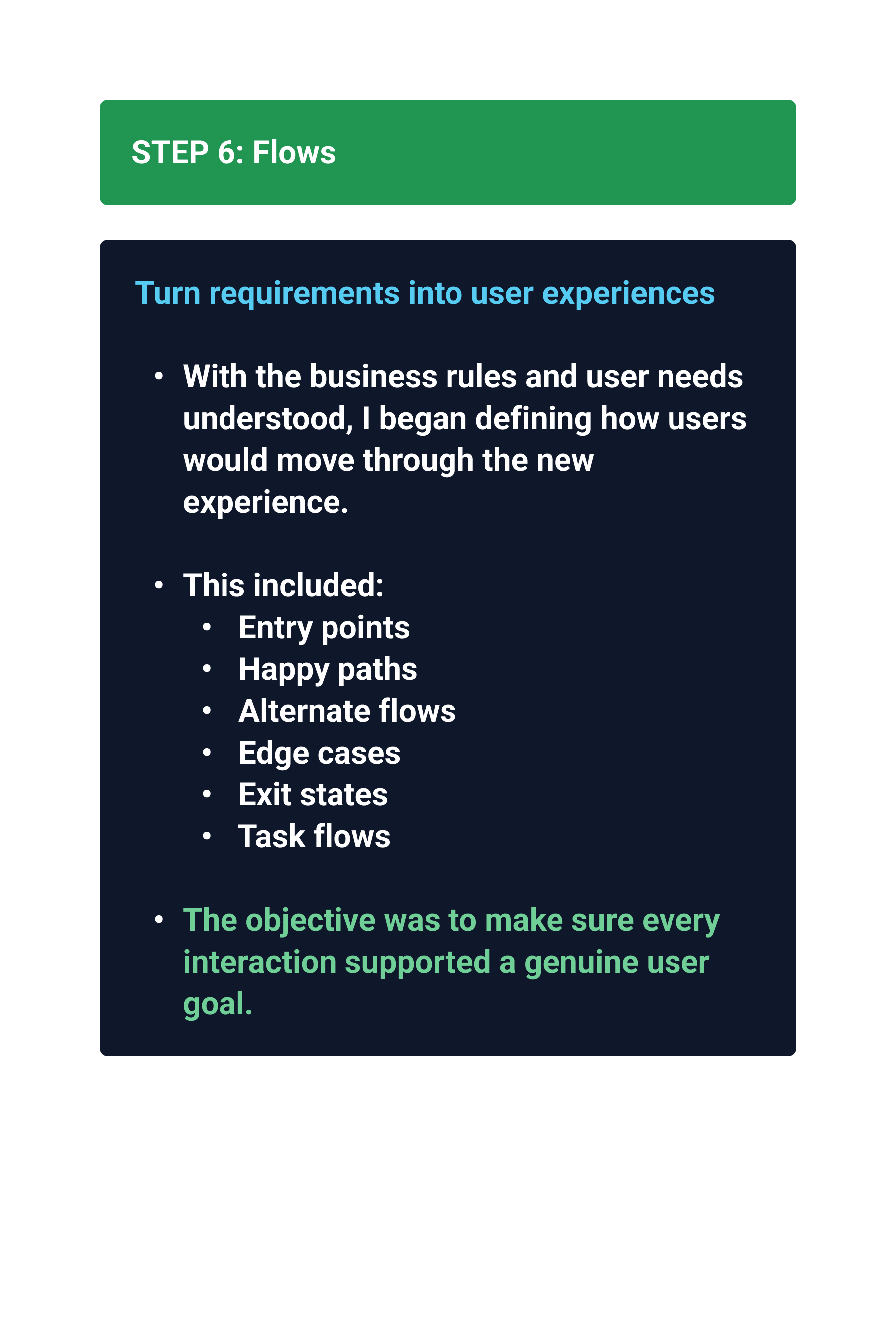
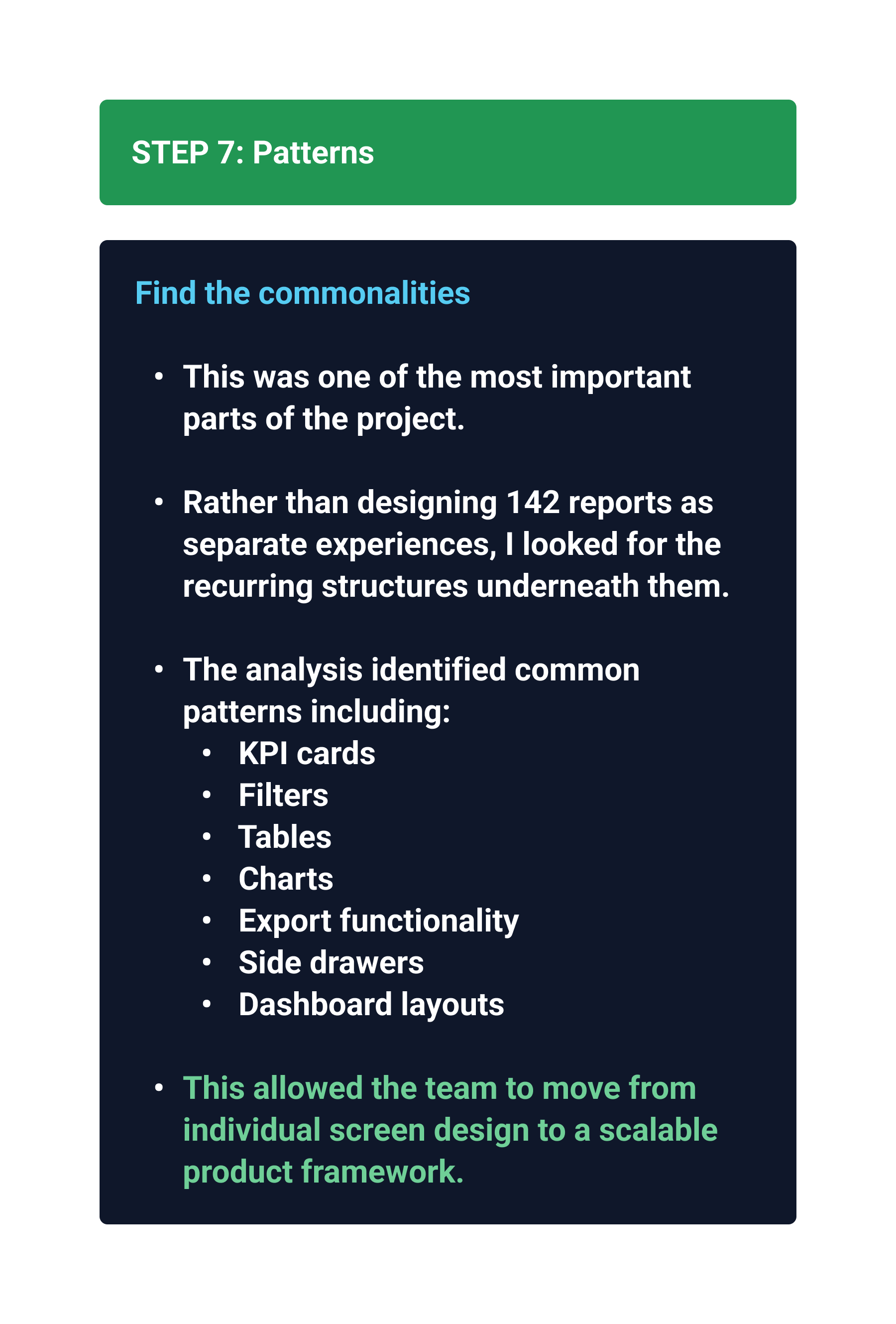
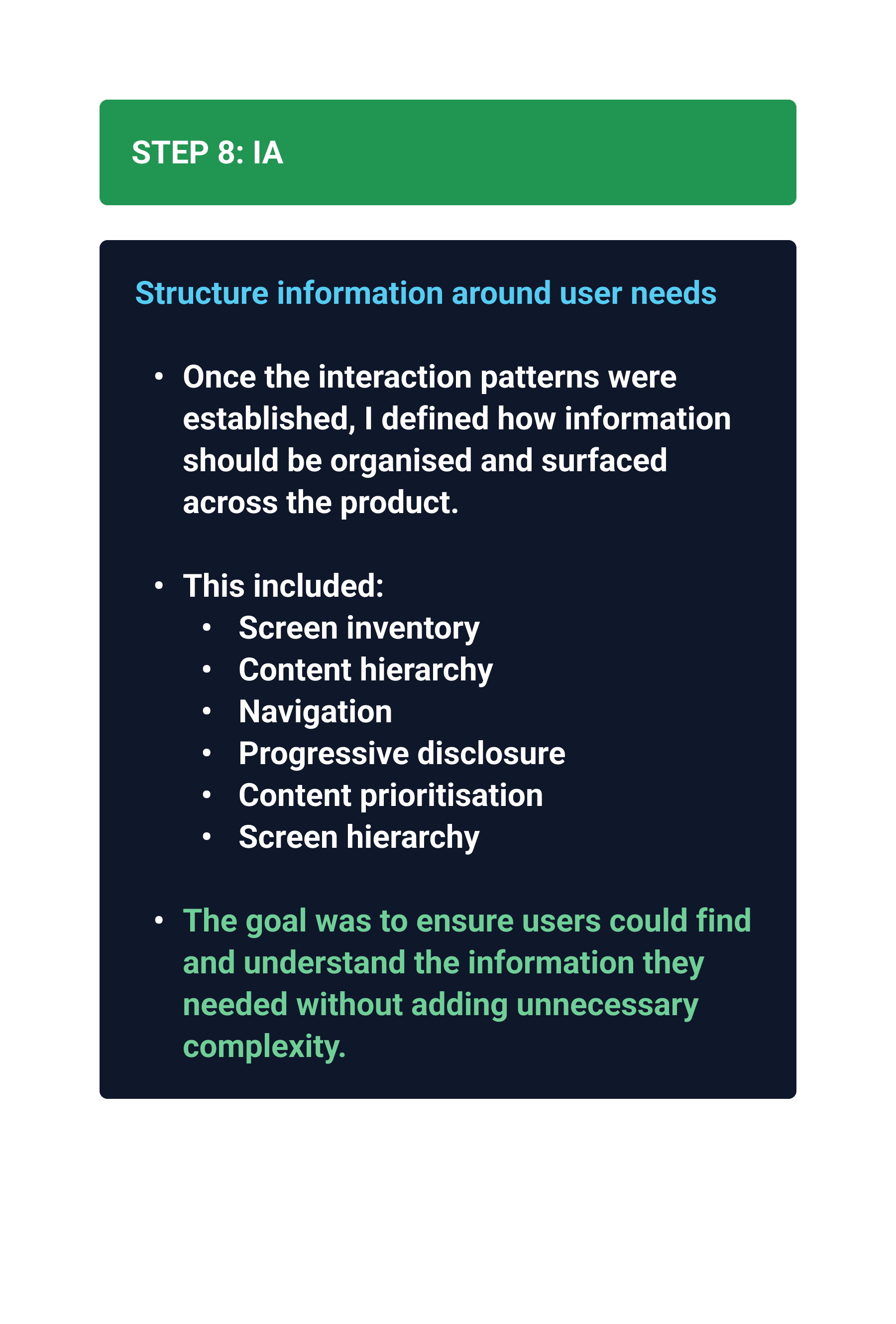
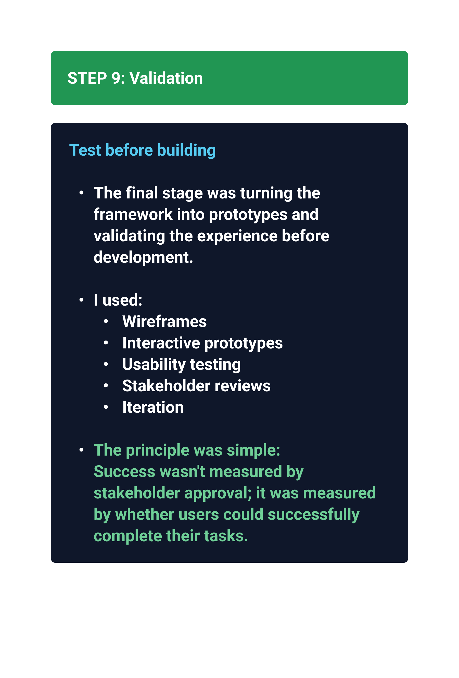
From 142 Screens
to a System
142 experiences
Common structures
Reusable patterns
Scalable framework
Pattern Library
KPI cards
Tables
Filters
Charts
Side drawers
Dashboard layouts
Export actions
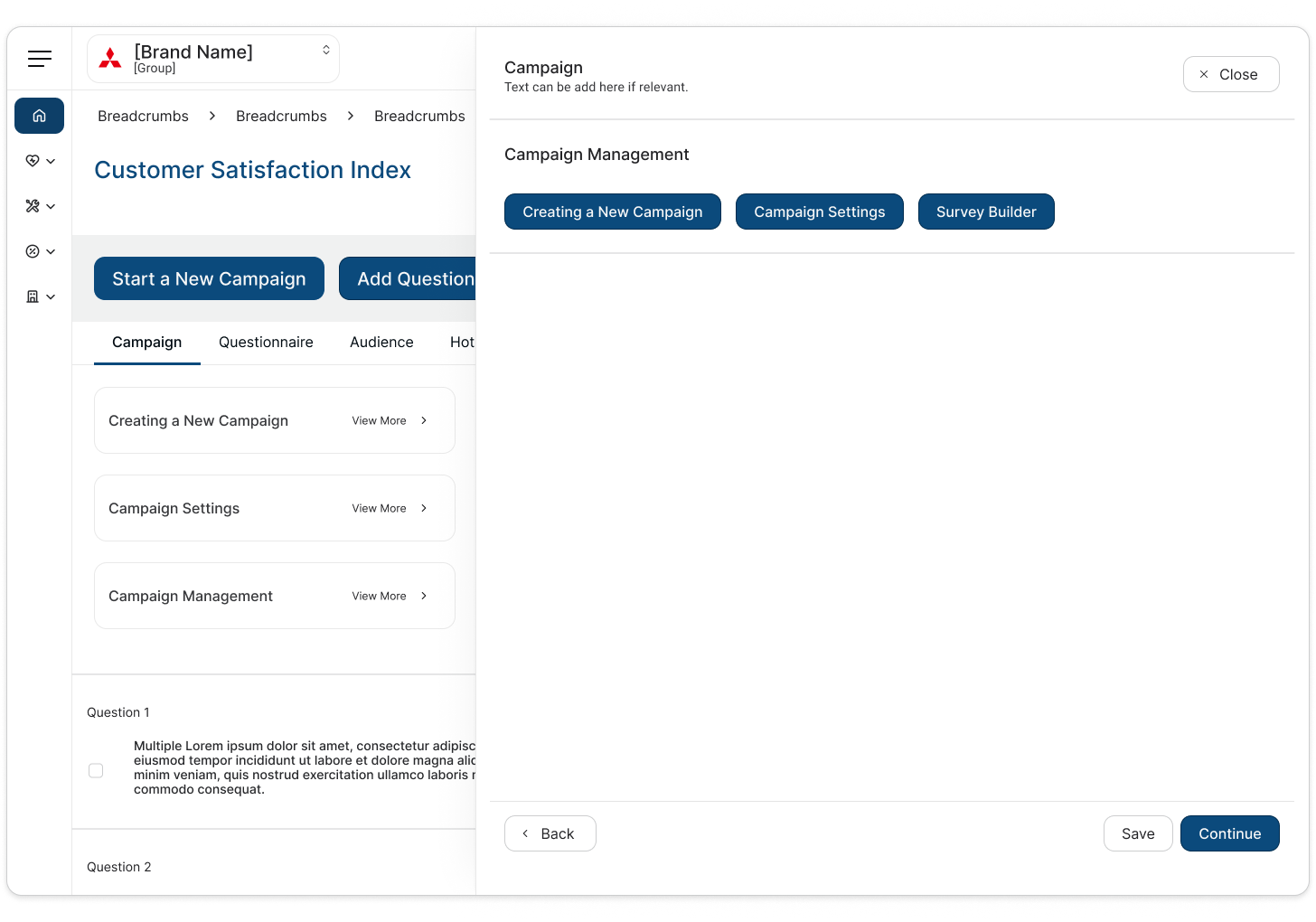
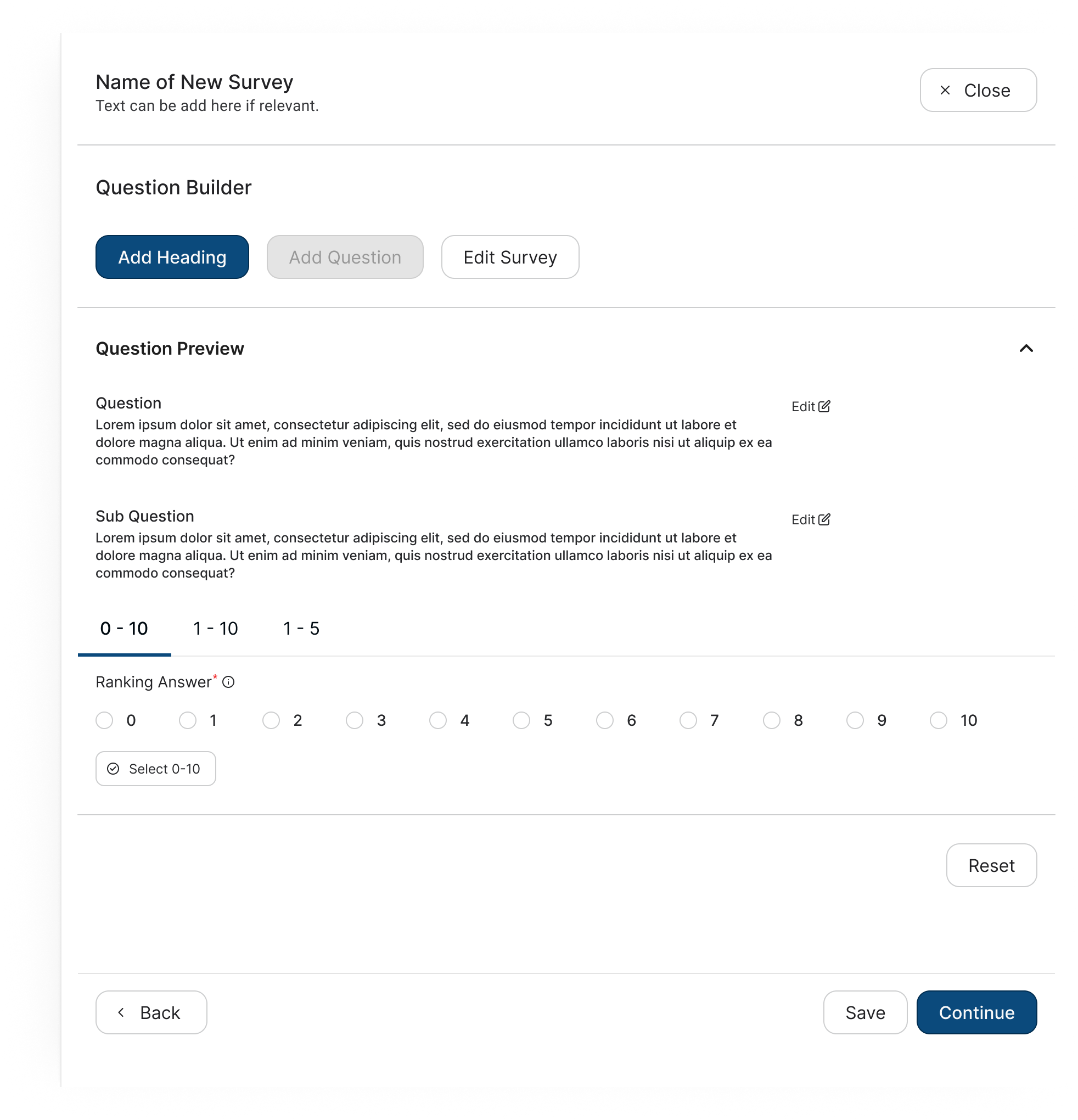
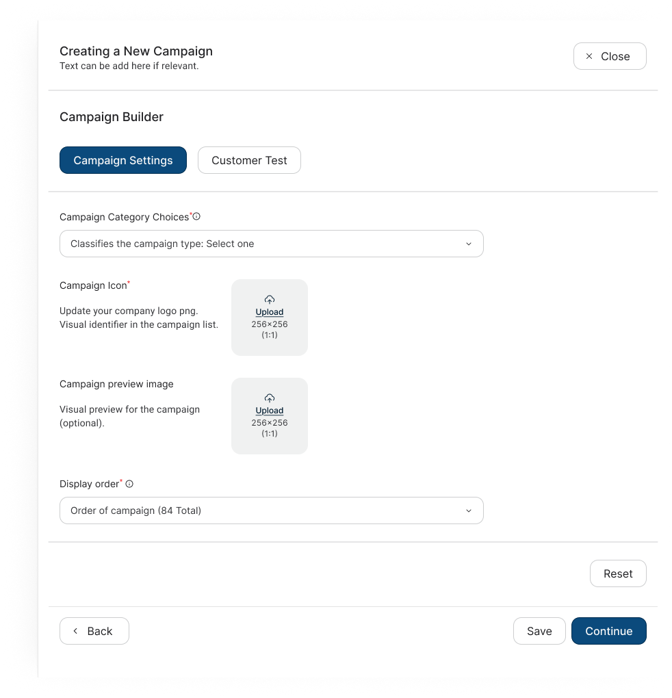
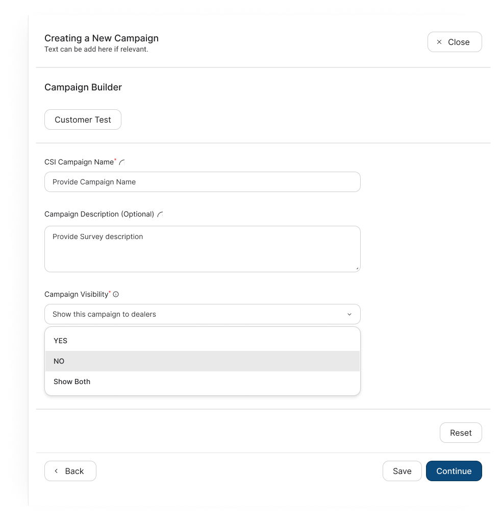
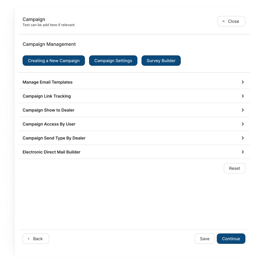
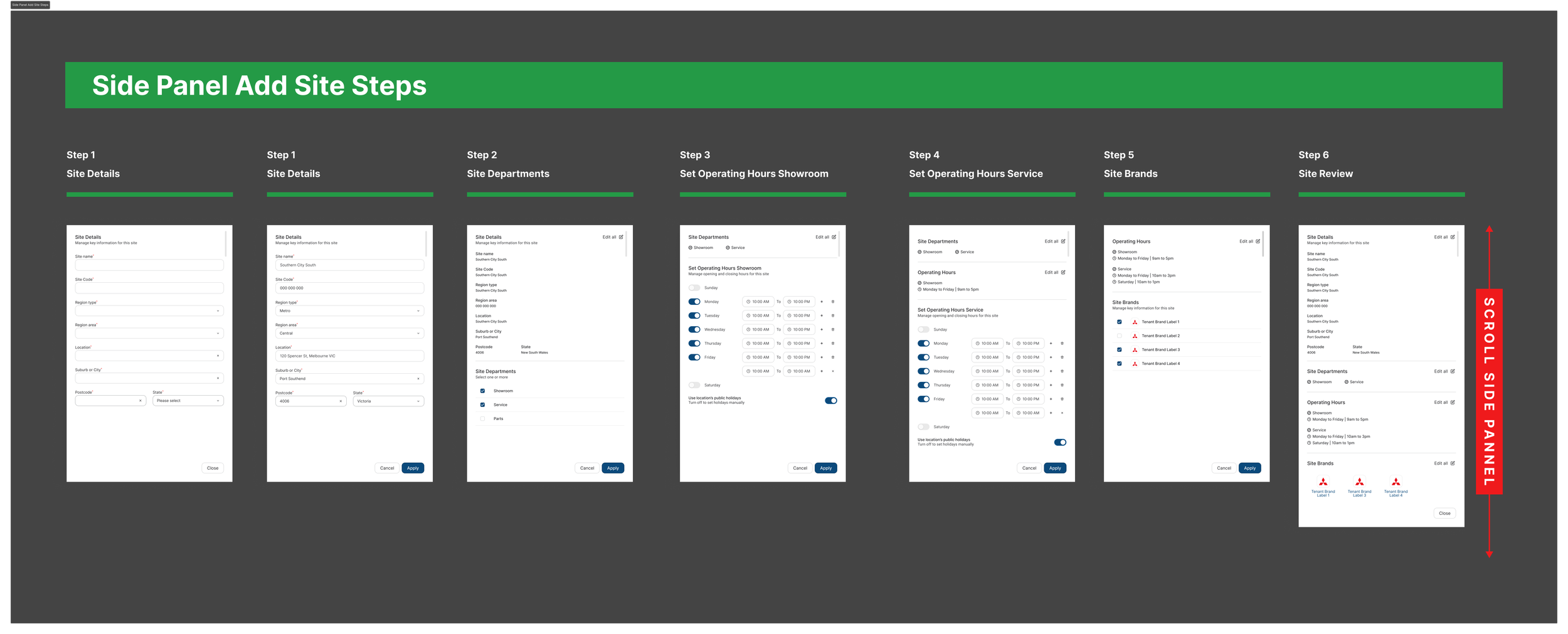
Before
Legacy Platform
Legacy platform
Fragmented
Inconsistent
Tenant-specific
Difficult to understand
Business logic hidden in UI
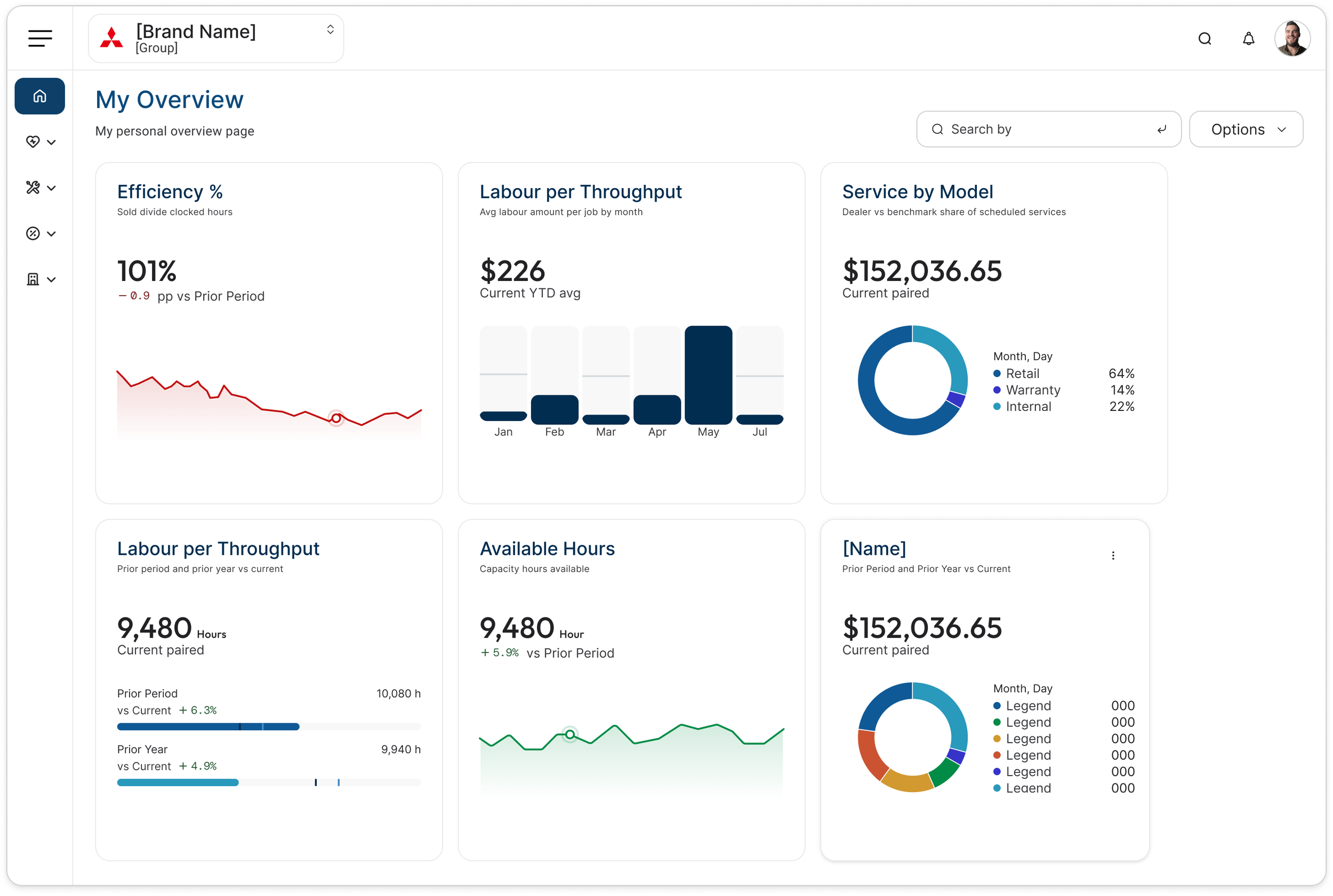
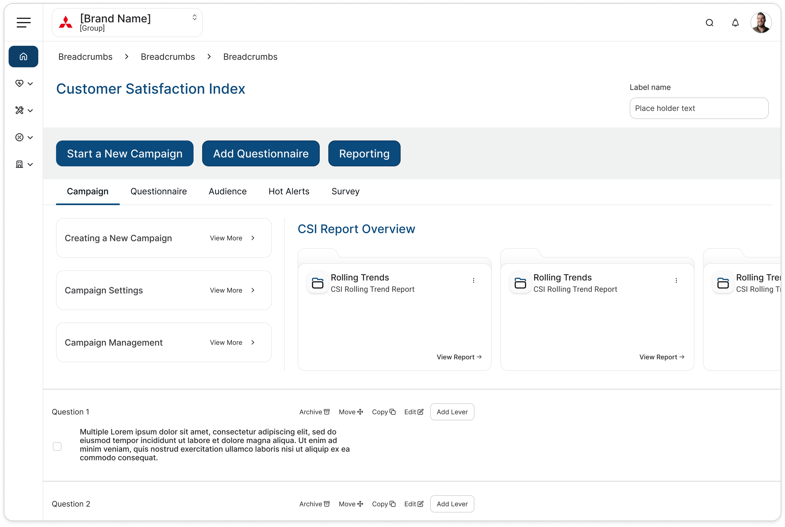
Design System
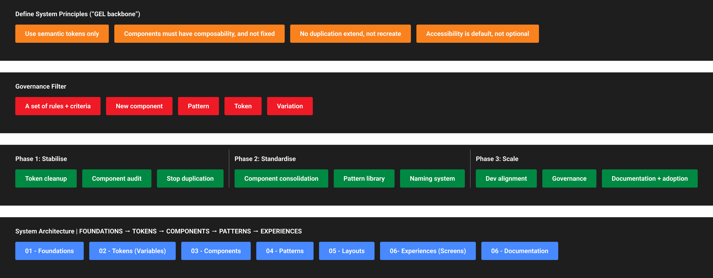
Way of Working
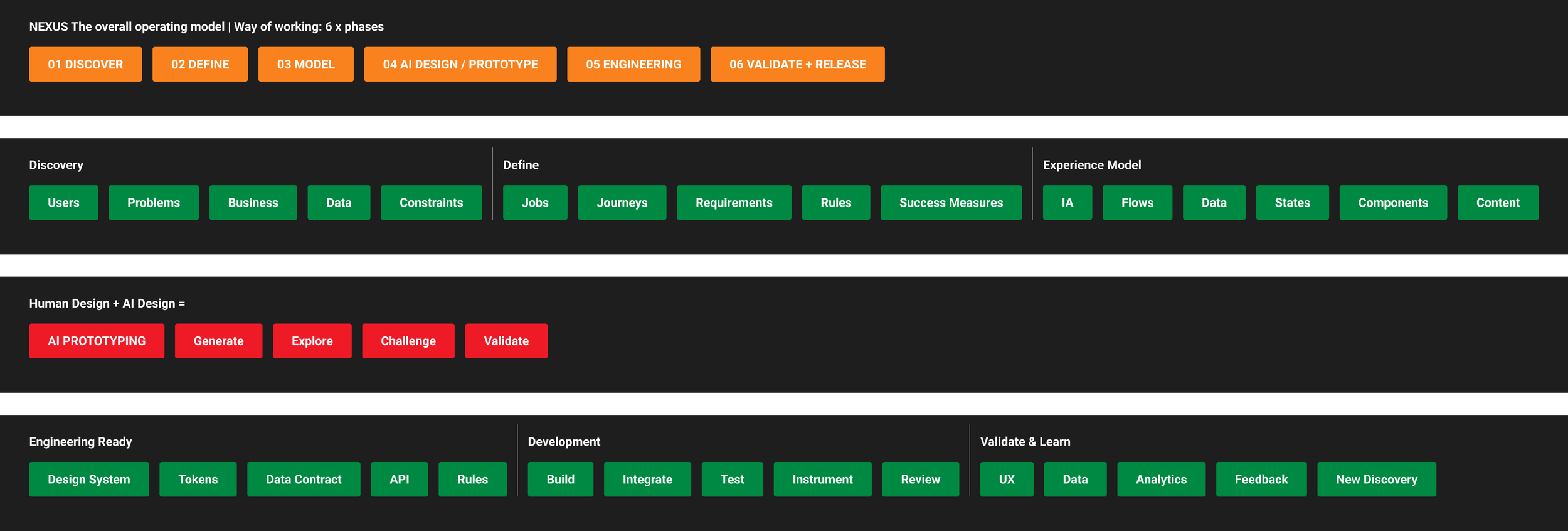
Infomedia: What I learned
Three big lessons:
1. Understand before you simplify
You can't simplify a complex enterprise product without understanding why it's complex.
2. Patterns are more valuable than screens
The real design output wasn't 142 redesigned reports;
it was the framework underneath them.
3. AI is most powerful when paired with design judgement
AI helped accelerate analysis and discovery, but decisions still required UX reasoning, stakeholder knowledge and product understanding.